Challenges
Despite ranking ninth and third among free travel apps in the App Store and Google Play Store respectively (last updated: August 2024), App 1933 only achieved ratings of 1.9/5 and 3/5 on these platforms. Additionally, there are numerous competitive apps offering similar bus information services in Hong Kong.
Whether through daily interactions with friends and family or browsing social media platforms, I frequently encounter user frustrations with App 1933 when accessing bus service information (e.g., cluttered interface design, complex bus route search process - honestly, I couldn't help nodding while I was reading those comments. Sorry, App 1933! 🥶)
As a long-time user of App 1933, this prompted me to consider:
“ If I could redesign App 1933, how would I make it more user-friendly? ”
Goal
The goal of this redesign is to enable users to access bus service information more quickly and easily, thereby restoring their confidence in App 1933. After understanding the needs of different users, I set the following targets to resolve user pain points:
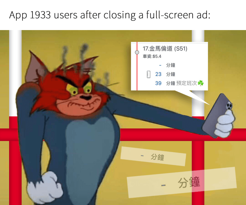
Strike a balance between KMB's advertising revenue and user experience by rearranging ad placement timing.
Transform confusing designs into more intuitive and simple ones.
Streamline the process of searching for bus routes to make it simpler and faster.
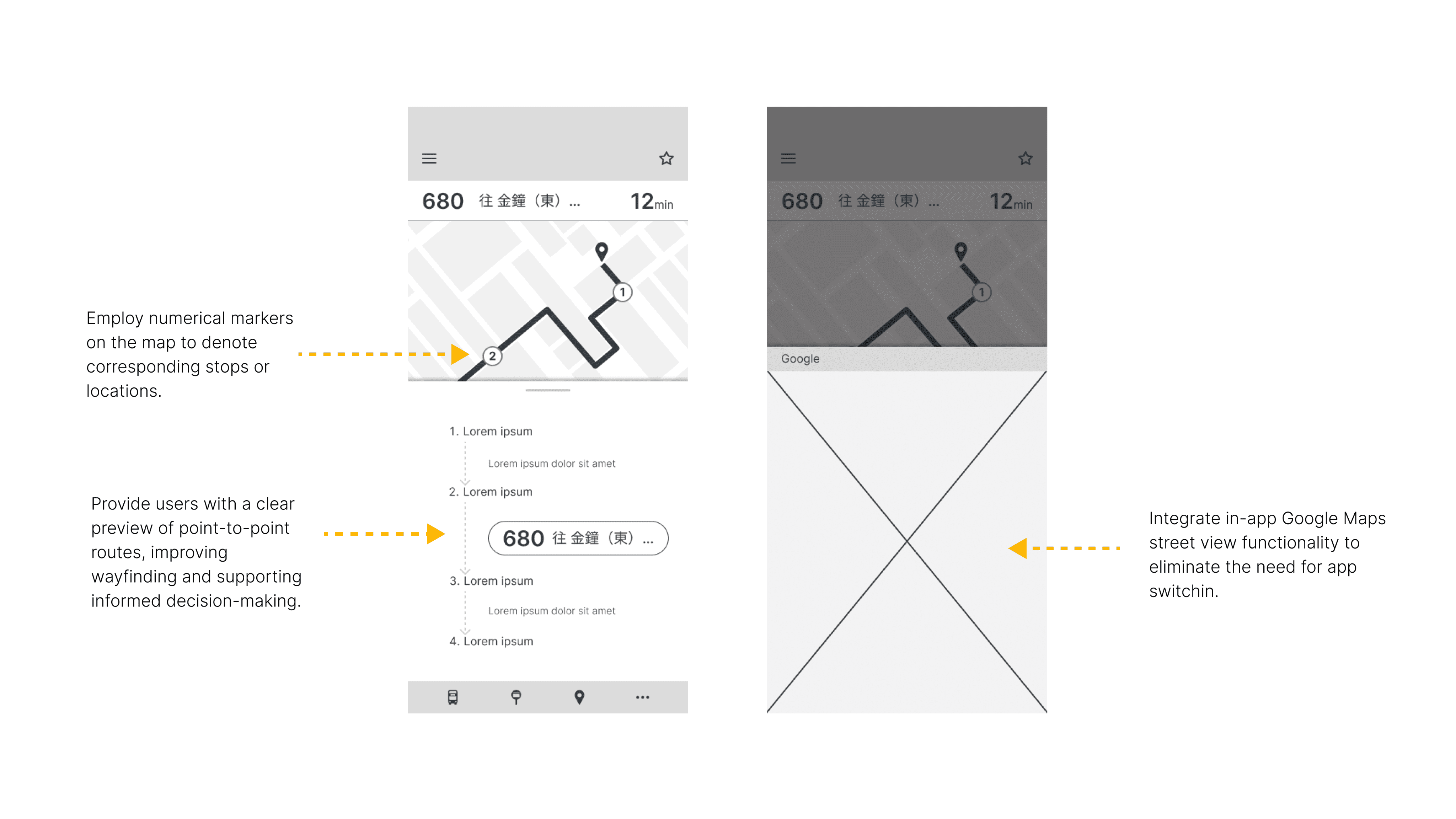
Provide clearer guidance for both information searching and journey details.
My Role
I am the sole UX designer leading this redesign project. After reviewing the original design, I conceptualized the overall direction for the redesign, and then implemented each design enhancement step by step. Here are my responsibilities:
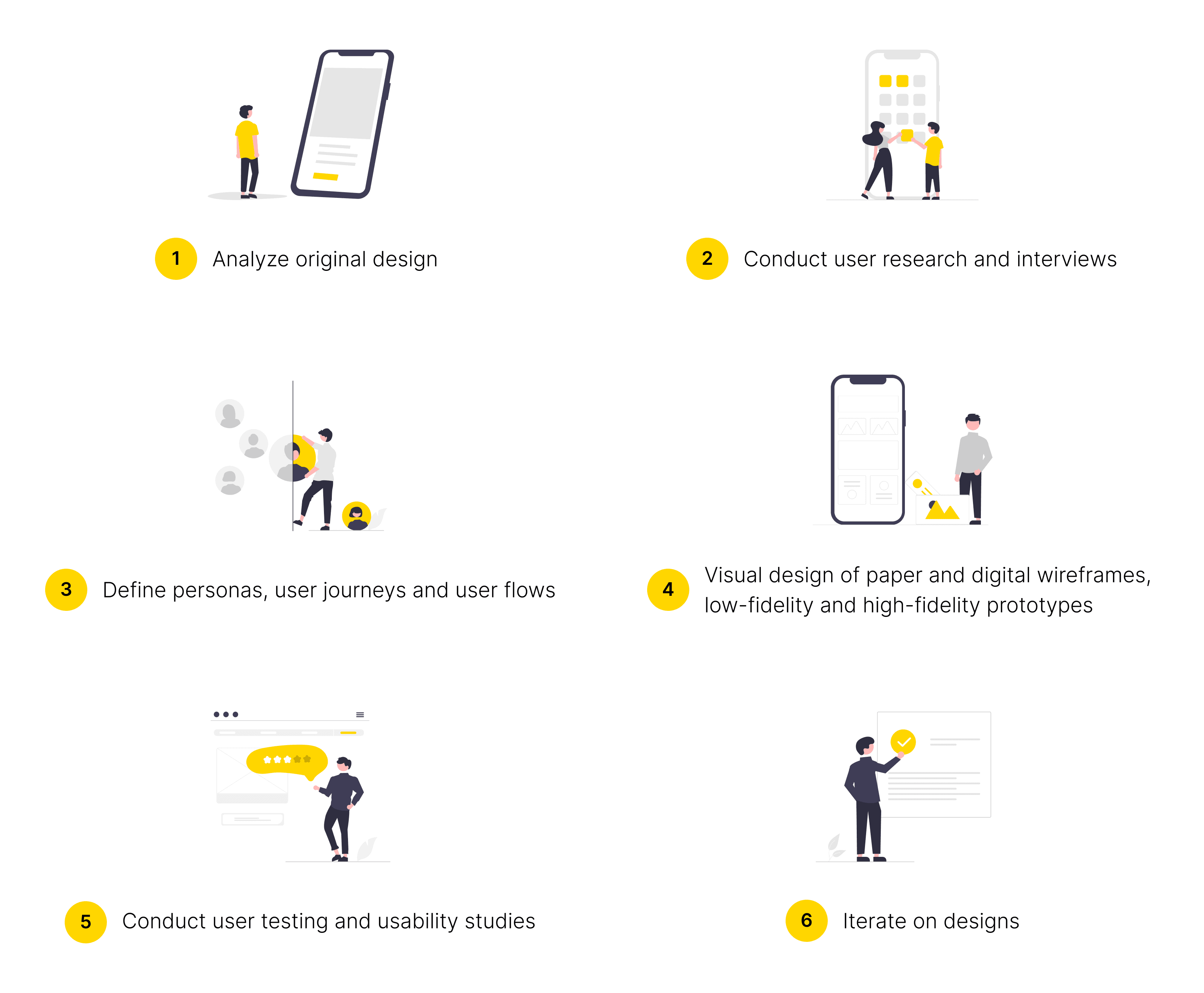
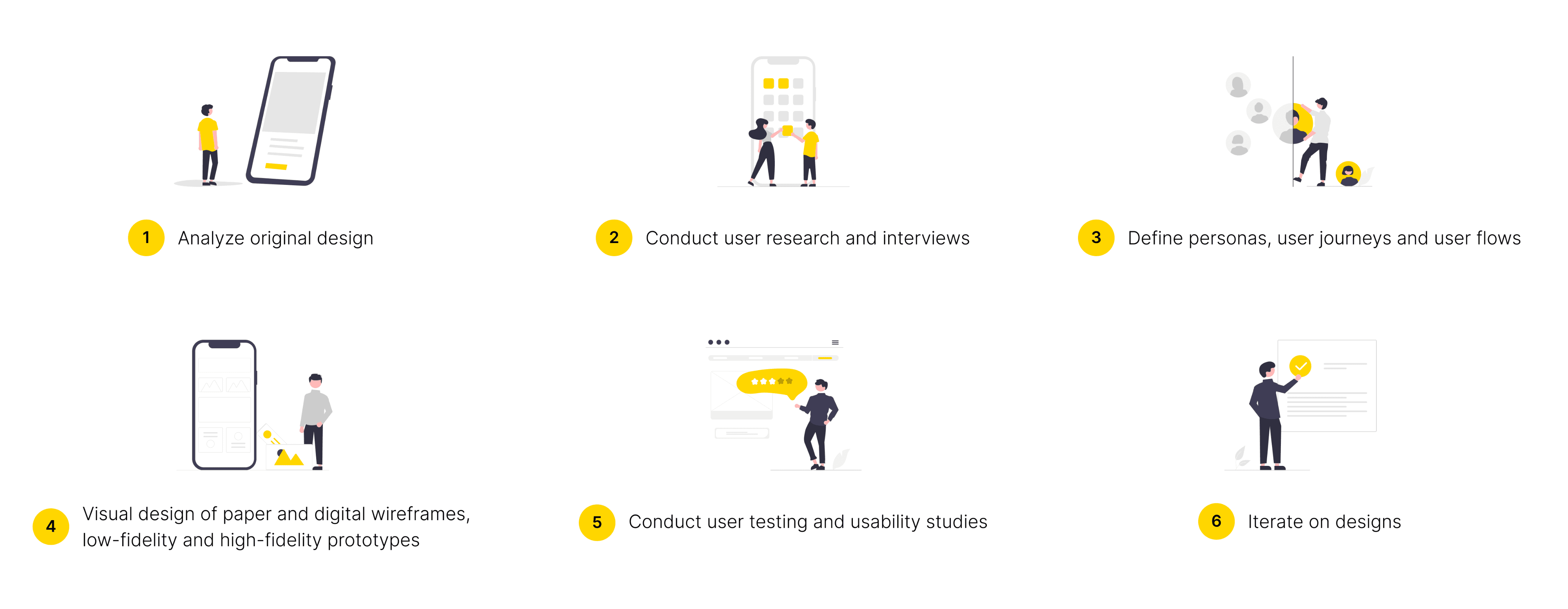
Redesign Process
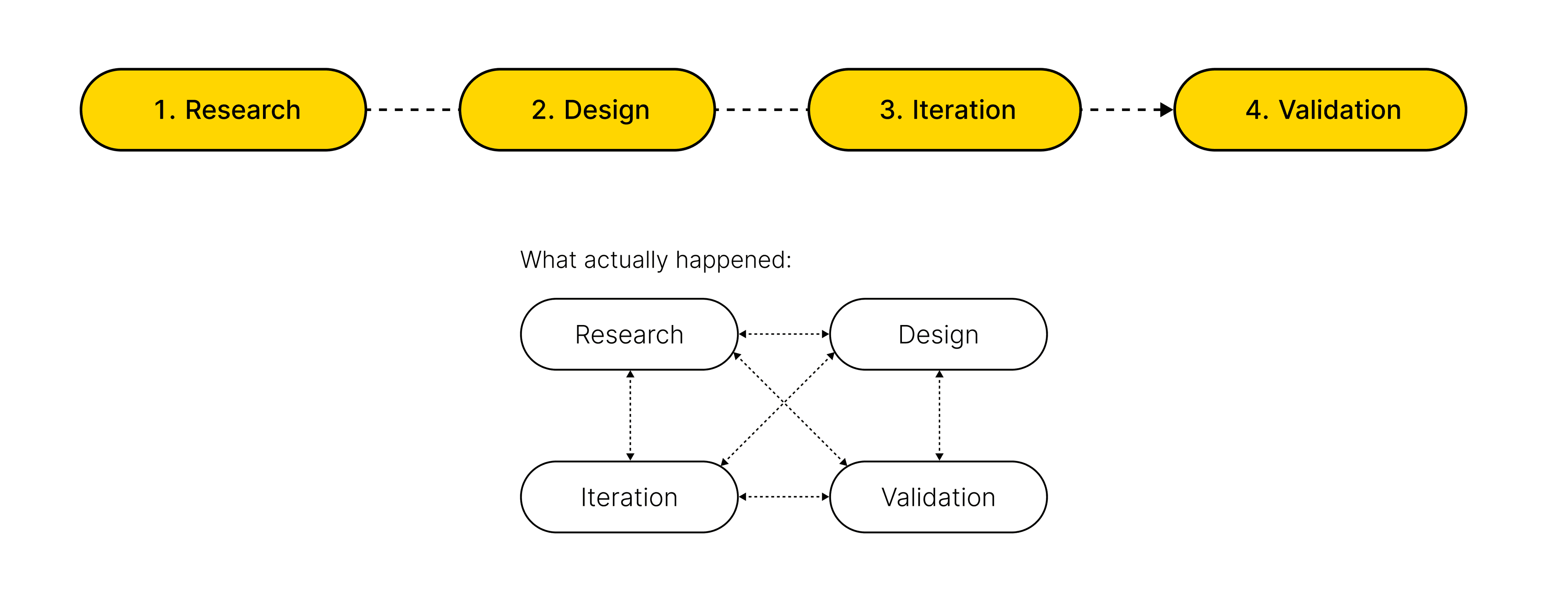
Research overview
I applied 4 research methods to understand the processes users go through to find their best route and their pain points during the process:
App Store and Google Play Store reviews analysis
Competitive Studies
User Interviews - 10 interviewees
Online Survey - 30 participants
1
App Store and Google Play Store Reviews Analysis
2
Competitive Studies
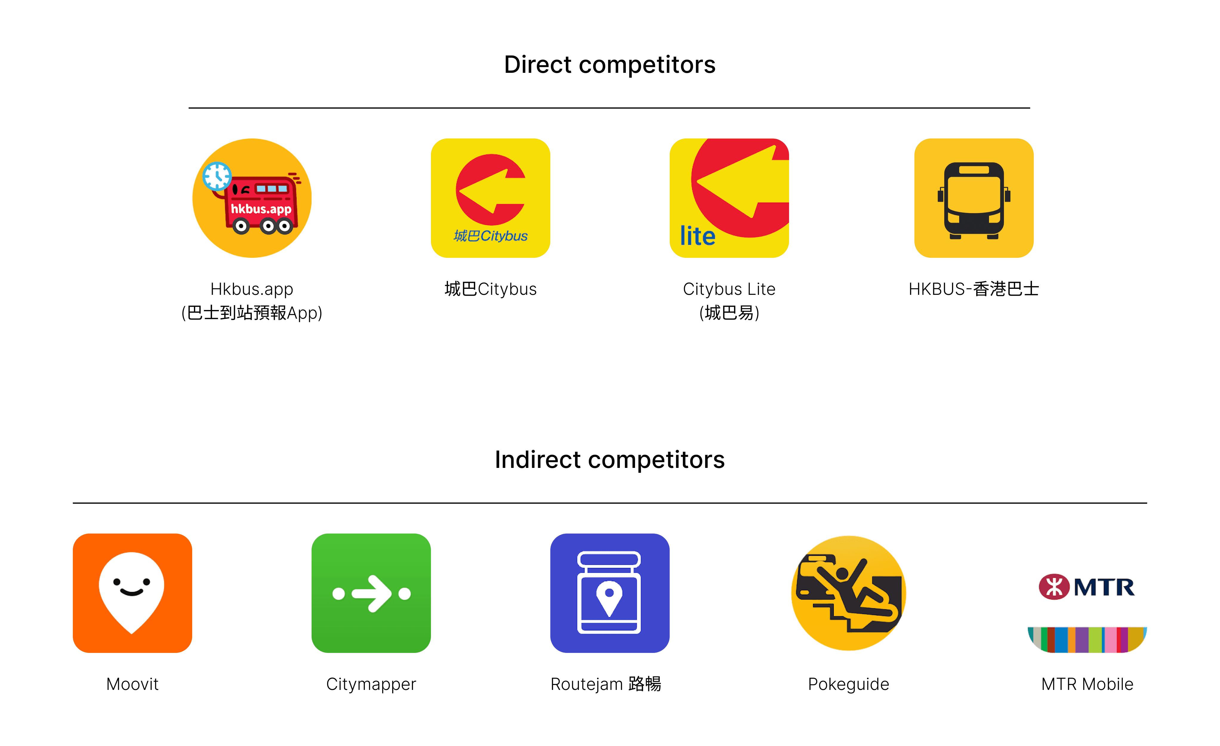
Given the presence of numerous apps offering similar services in the market, conducting a Competitive Analysis serves as another crucial method for understanding user needs and market positioning. I've categorized 9 competitors that provide bus service information similar to App 1933 into two groups: direct competitors and indirect competitors.
This analysis aims to examine these apps from both UI and UX perspectives, identifying similarities, differences, strengths, and weaknesses. This process allows me to pinpoint opportunities for differentiation and improvement. Among the competitors, HKBus.app(巴士到站預報App) and Moovit emerged as key competitors to App 1933. Here’s the link to the summary of my analysis.
3
User Interviews
Sample size: 10 interviewees
Target participants: App 1933 current and former users, aged 15 and above, diverse in gender and occupation (including students, working professionals, and retirees)
Common characteristic: Regular bus users who have experience planning trips with App 1933
Interview focus: Gathering positive and negative feedback on App 1933, identifying pain points, and comparing perceptions with similar apps
Format: One-on-one interviews conducted via Zoom
4
Online Survey
Sample size: 30 participants
Target audience: Similar to User Interviews
Purpose: Collect broader data set for analyzing user behavior
Design: Mixed-method approach with both qualitative and quantitative questions
Format: Concise questionnaire designed for quick completion to maximize response rate
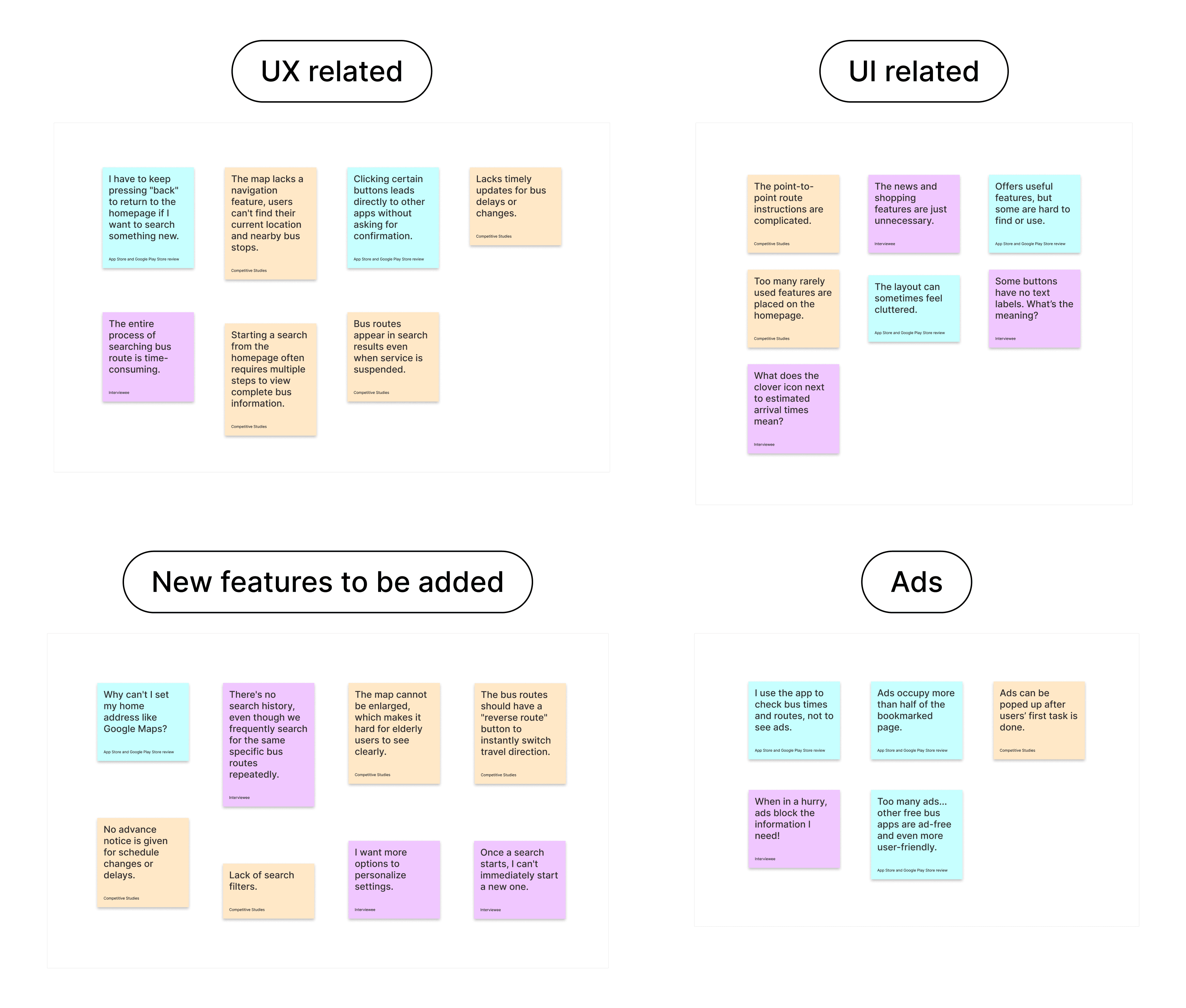
Affinity Diagram
To synthesize findings from the 4 research methods into actionable redesign directions, I categorized all findings into 4 main groups to avoid redundancy and maintain clarity. Here is the refined Affinity Diagram with structured insights:
Key research insights
Disruptive Advertising:
Users encounter full-screen ads upon opening App 1933 or before retrieving bus information, causing some to miss buses and leading to app abandonment.Navigation Friction:
The current design complicates route searches, requiring multiple "Back" taps to return to the homepage, creating unnecessary friction.Focus on Core Functionality:
Users want the app to prioritize essential features like bus schedules and routes, suggesting a simpler home screen with non-core features moved to a menu.Persistent Search Categories:
Fixing "Stops," "Bus Routes," and "Location" in the navigation menu would allow users to switch search methods easily.Accessibility for Elderly Users:
Improved readability and usability for elderly users are needed, specifically through clearer text and more intuitive icons.
Unexpected research findings
Real-time usage pattern:
The majority of users typically access App 1933 immediately before boarding a bus. This just-in-time usage allows for last-minute decisions on whether to switch to alternative bus routes or transportation modes.Limited regular routes:
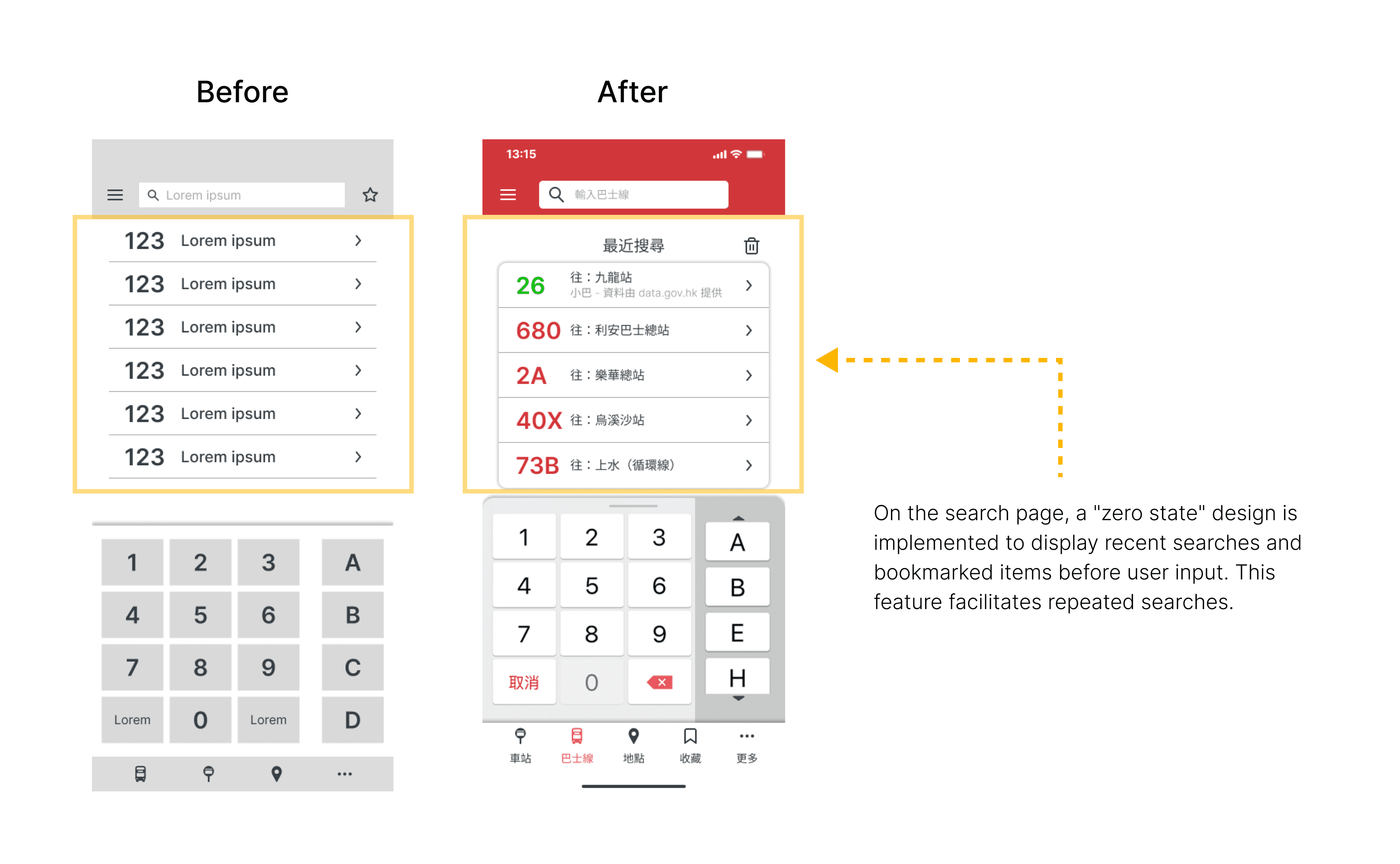
Users habitually search for and ride no more than five bus routes. Notably, a "Recent Searches" feature, which could significantly enhance user experience for this behavior, has been absent from App 1933.
Research summary
The insights highlight several critical areas for improvement in App 1933's user experience:
Rethinking the advertising strategy to minimize disruption to core app functionality.
Streamlining the process of initiating new searches and switching between different search types.
Focusing the main interface on core features while intelligently organizing secondary features.
Enhancing visual design elements to accommodate users across all age groups.
Introducing features like "Recent Searches" to align with observed user behavior patterns.
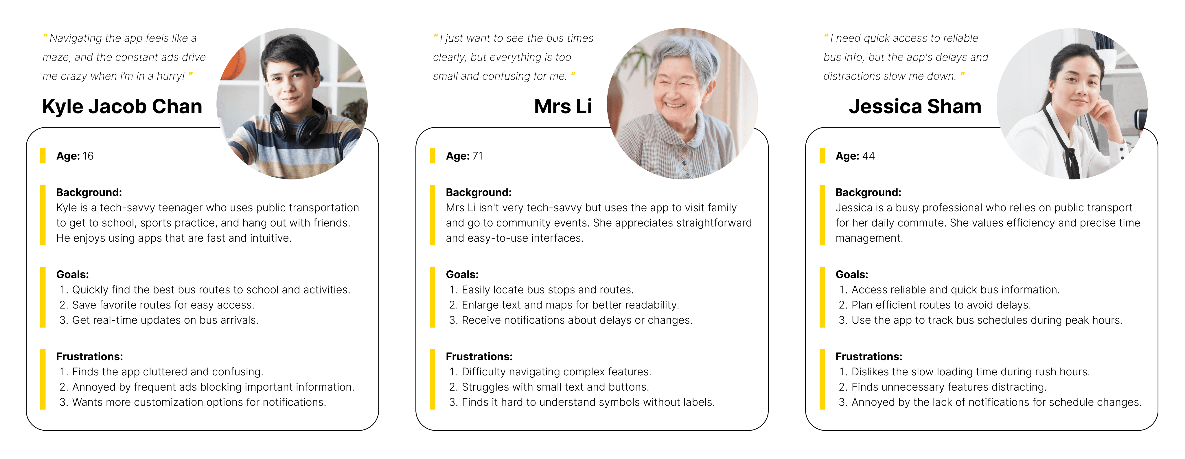
Personas
After gathering and analyzing research insights, the next step is to synthesize this data into representative user personas. This process involves identifying patterns in user behaviors, goals, pain points, and preferences across the collected data. The purpose of creating personas is to distill the research findings into archetypal users that embody the key characteristics and needs of the target audience.
Sitemap Restructuring
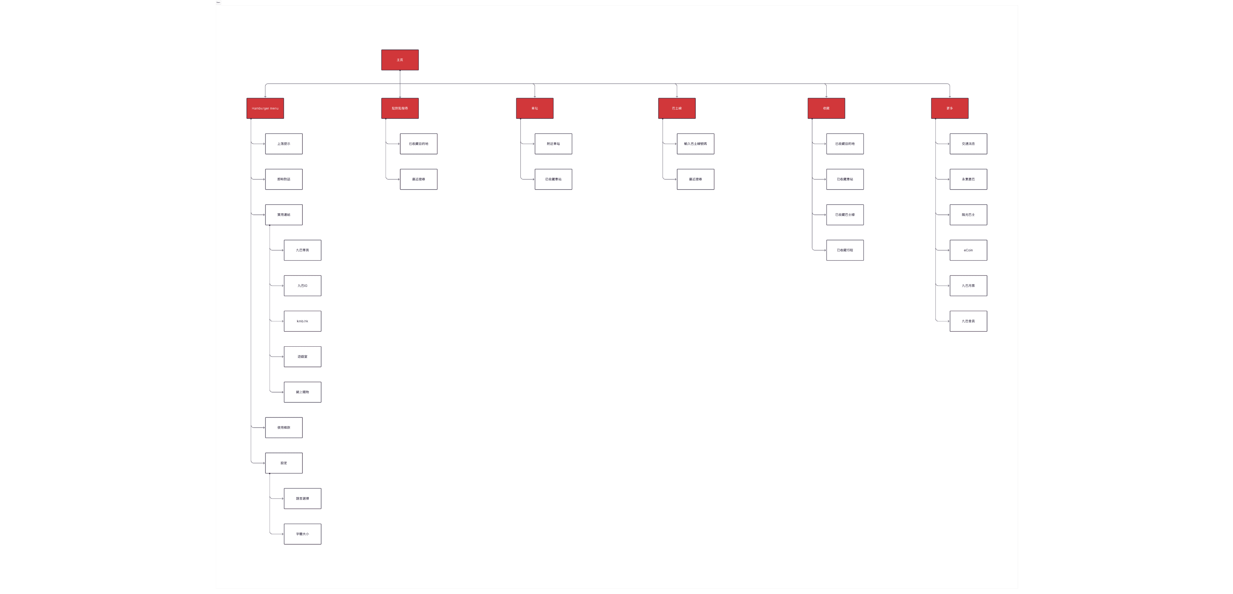
Before developing the redesigned sitemap for App 1933, I first constructed a sitemap based on the original homepage's features and elements. This approach helps identify existing issues in the current information architecture. It also acts as a comprehensive checklist, ensuring no existing functionality is overlooked in the redesign process.
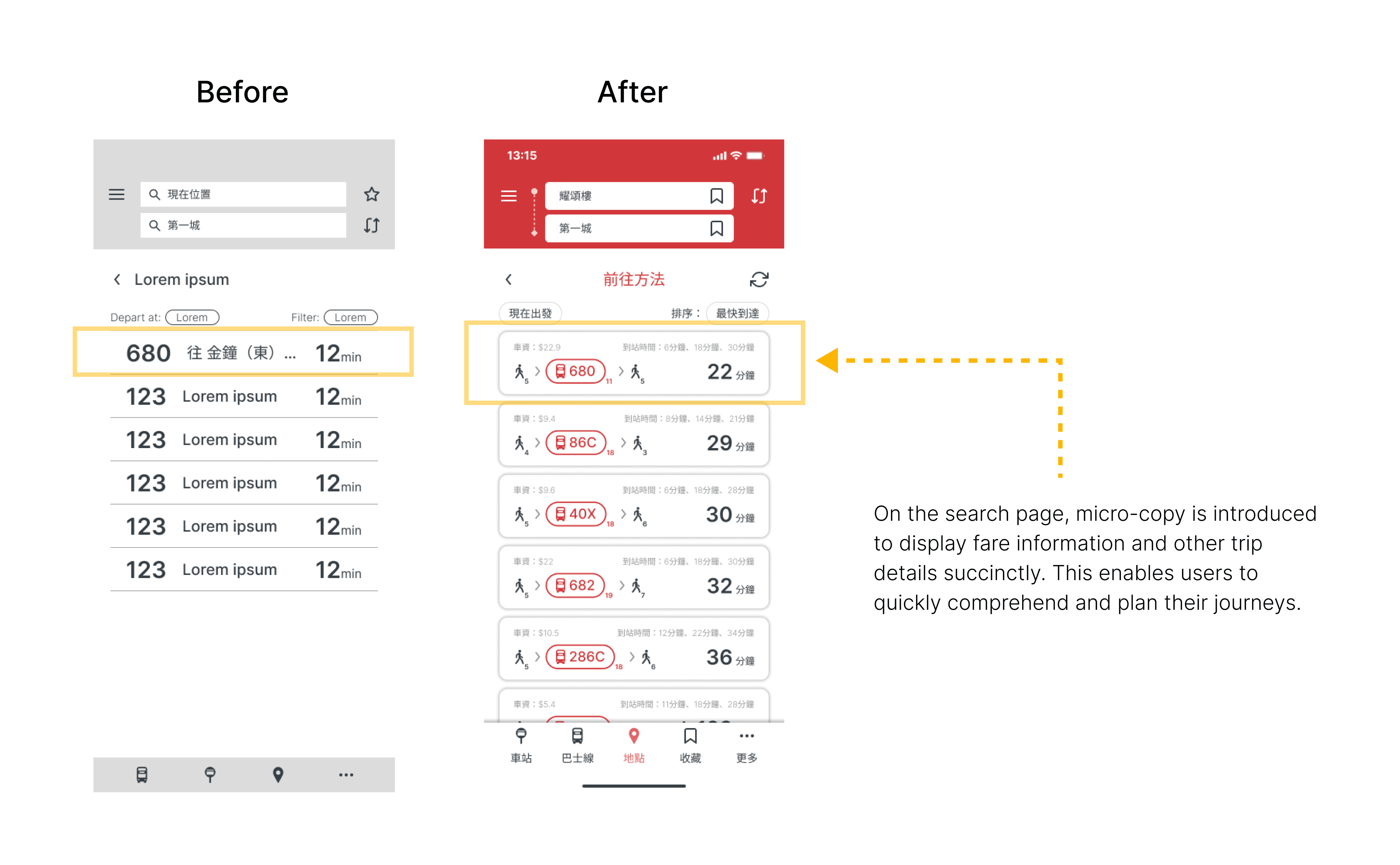
When I juxtaposed the original and redesigned sitemaps, a key observation emerged: the current design of App 1933 overloads the landing page with an excess of features. Crucially, some important functions, such as the "Traffic Updates" in the navigation menu, are positioned below the fold, necessitating additional scrolling for visibility and access.

To address these issues, I've implemented the following changes in the redesigned sitemap:
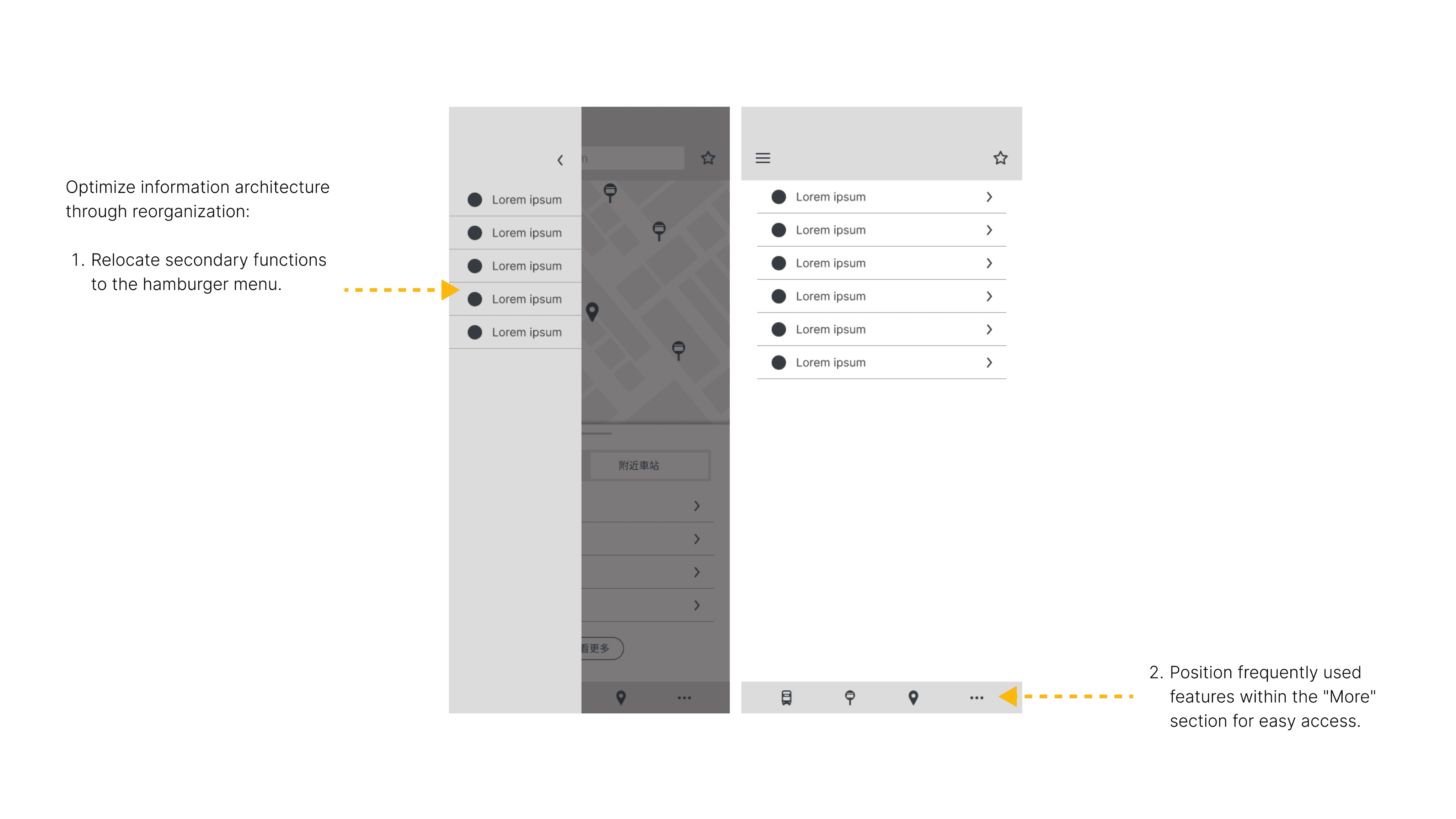
Less frequently used features have been relocated to a "More" section and within the hamburger menu.
Core features are now positioned prominently, ensuring they're immediately visible without requiring scrolling.
The new sitemap establishes a clear hierarchy of information.
The landing page is simplified in order to benefit users who may struggle with complex interfaces.
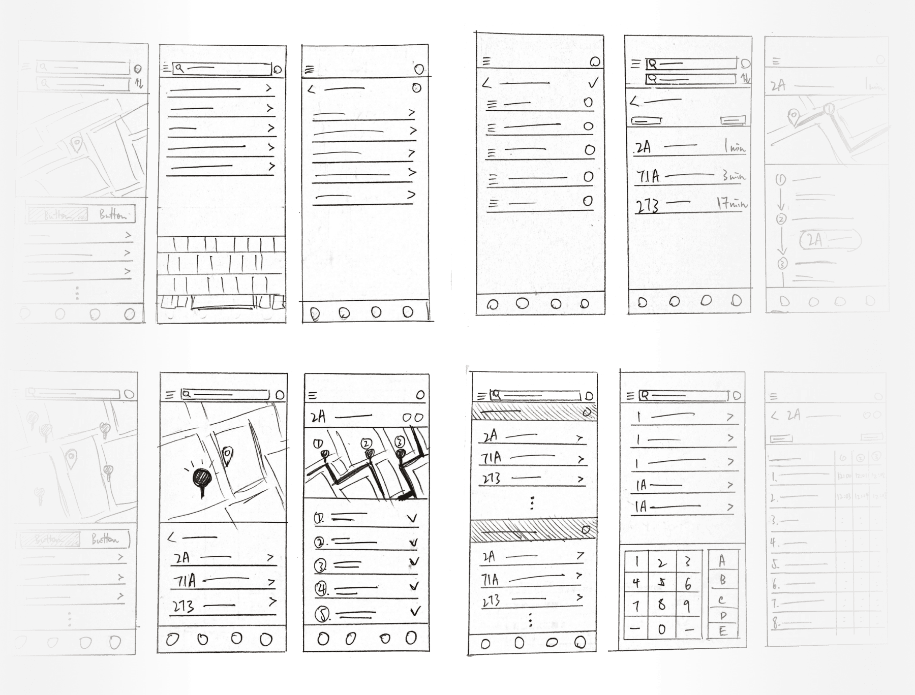
Paper Wireframes
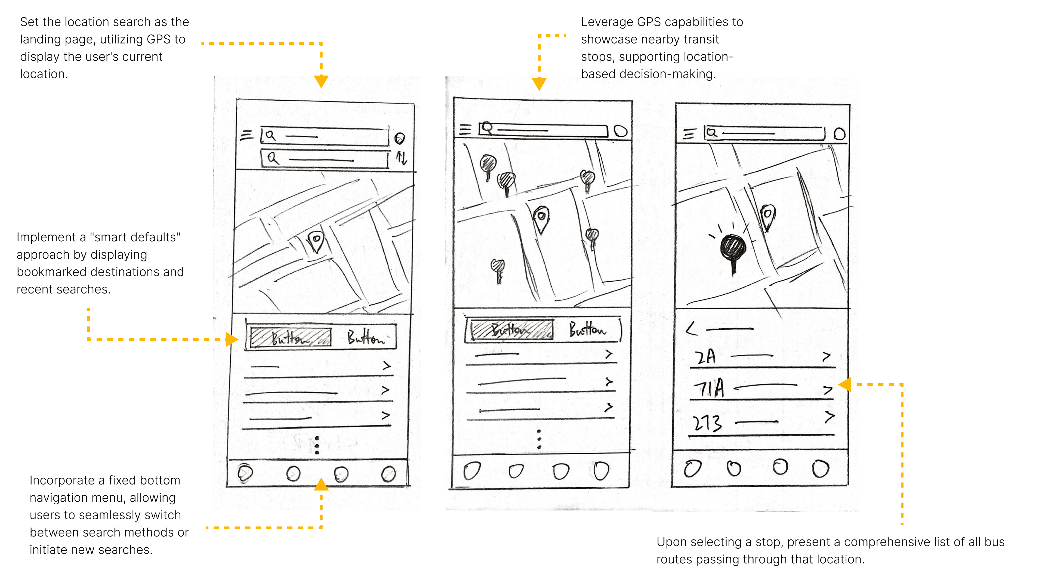
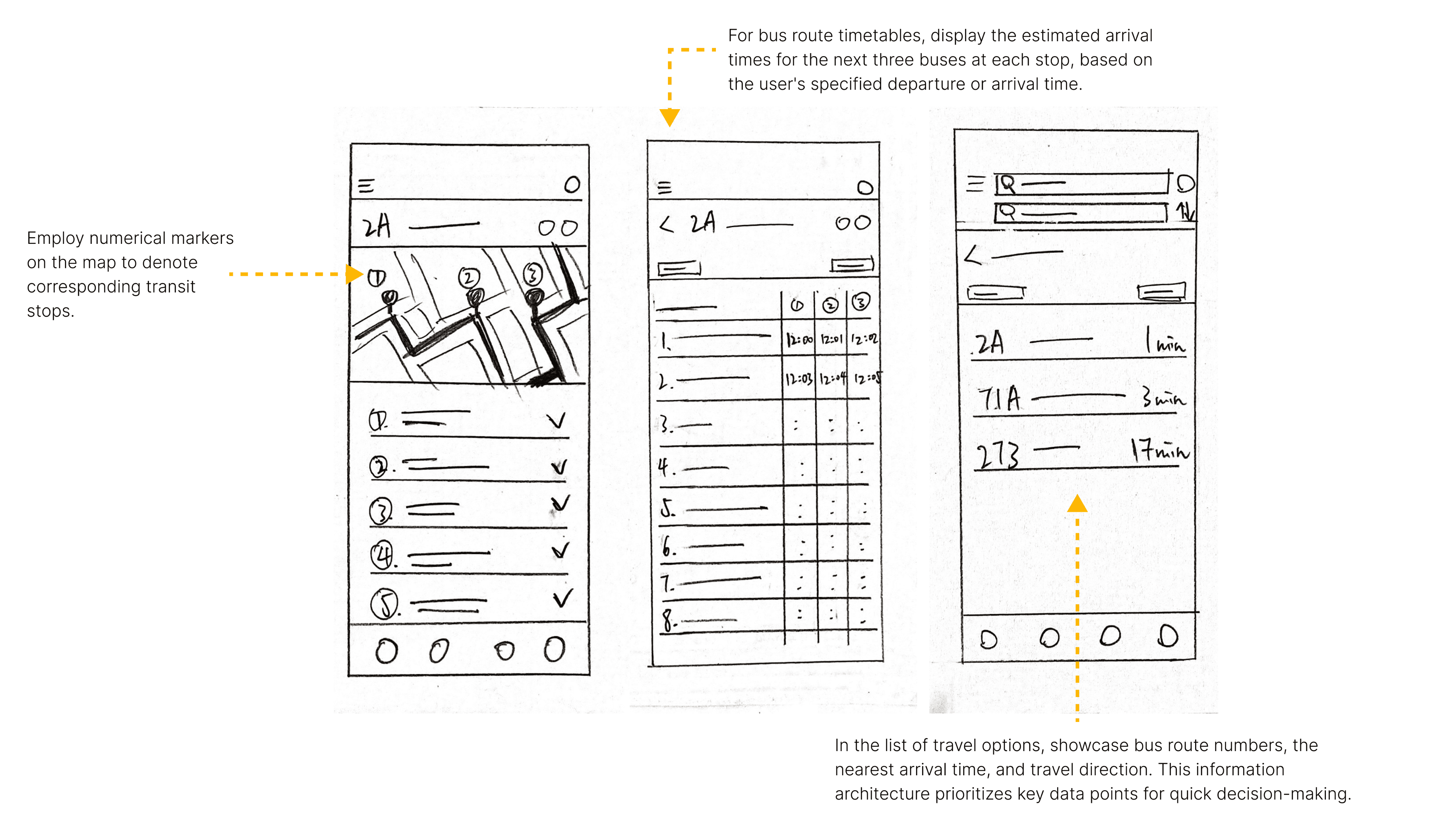
After finalizing the sitemap, I proceeded to develop the wireframes for the redesign. I began with rough sketches of key features and interfaces using paper wireframes, which allowed for quick ideation and iteration.
View full image of paper wireframes and check out the following design concepts:
Digital Wireframes
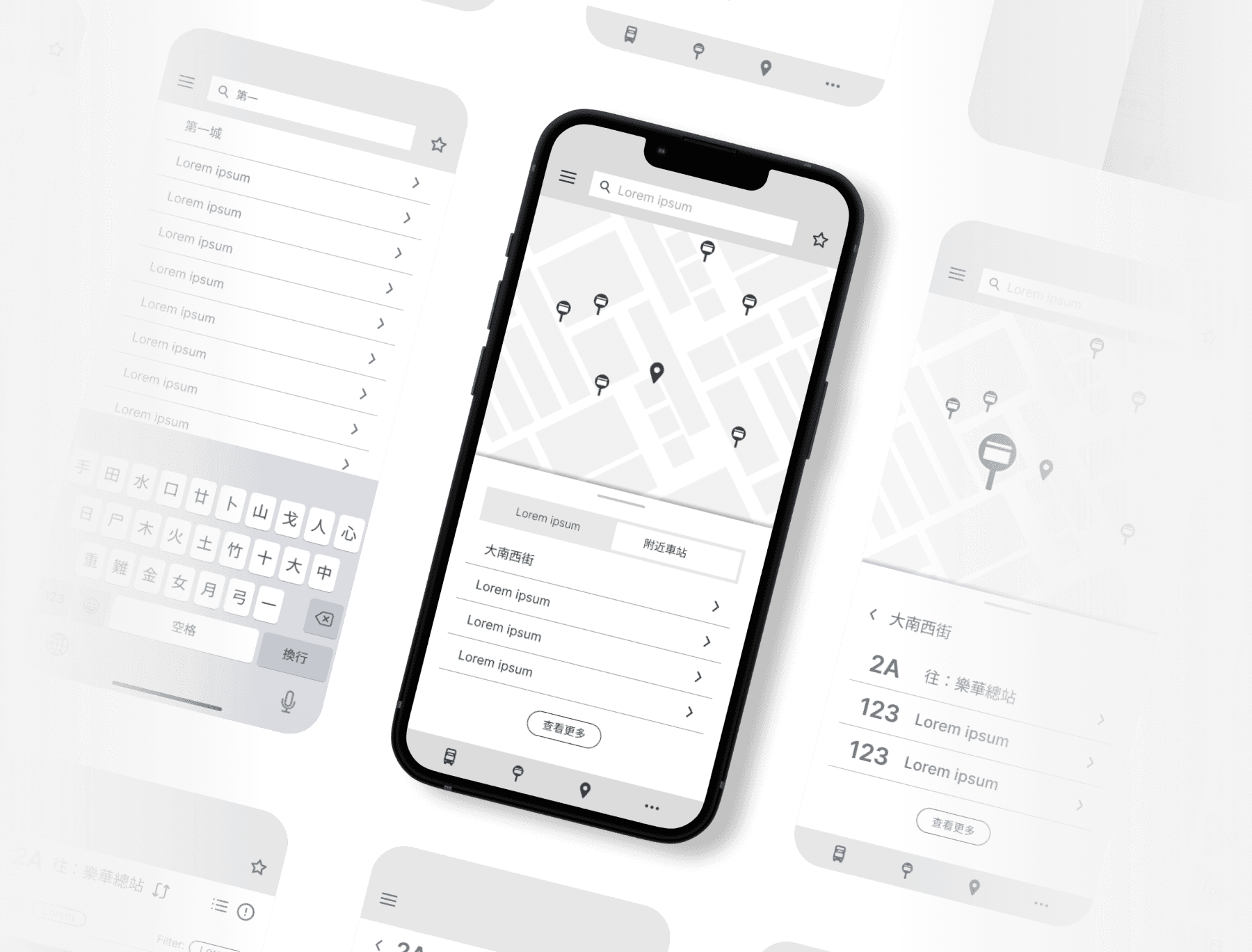
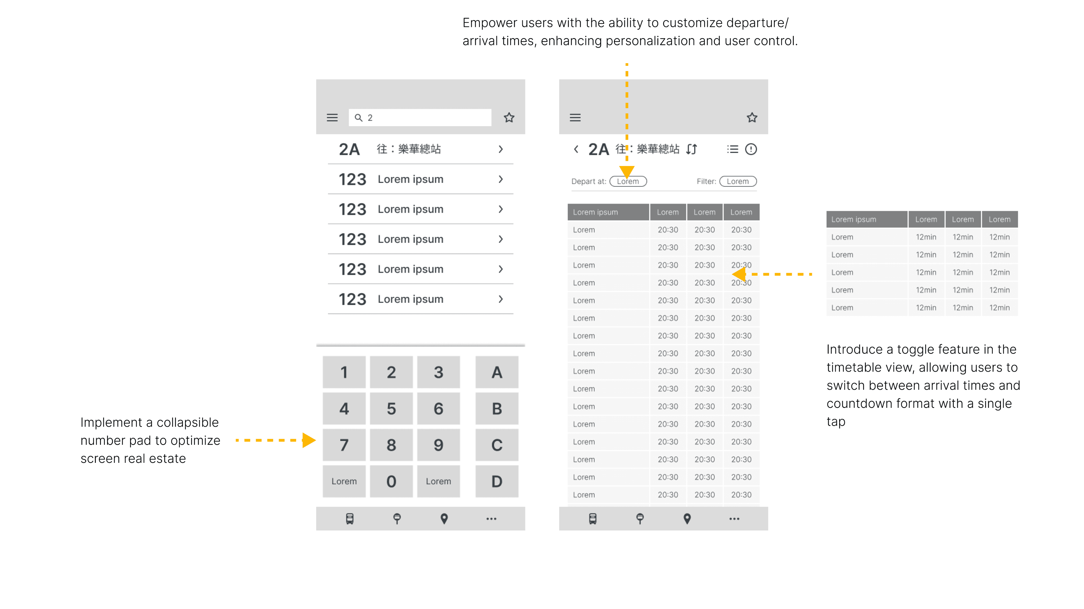
Using the initial concepts of paper wireframes as a foundation, I then created digital wireframes in Figma. During this transition from paper wireframes to low-fidelity prototypes, I incorporated additional details that were overlooked in the initial paper wireframing stage.
Check out the following design concepts:
Low-Fidelity Prototype
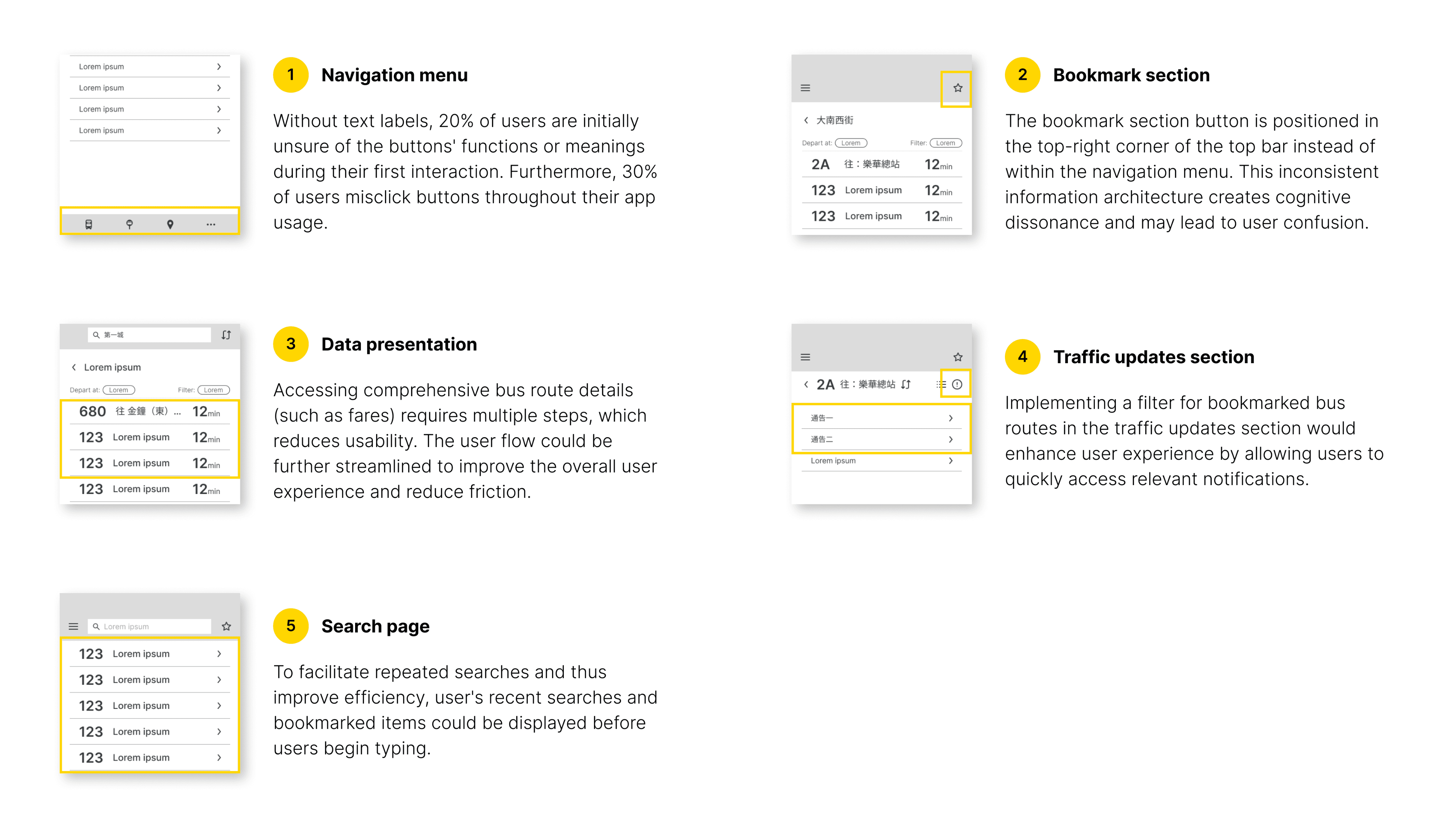
Upon completing the initial digital wireframes, I proceeded to connect all the screens to create a low-fidelity prototype for subsequent usability testing. To evaluate the prototype's effectiveness and identify any potential blind spots in my design, I invited 10 participants who had previously taken part in interviews or completed the Online Survey. These participants were invited to interact with the low-fidelity prototype, simulating real-world scenarios.
(For the best experience, please view the prototype on your mobile device. 📱)

This approach allowed me to observe how users navigated through the redesigned interface and identify any new challenges or pain points that may have been overlooked during the initial design phase. By conducting this early-stage usability testing with a low-fidelity prototype, I could gather valuable insights and make necessary adjustments before investing time in high-fidelity designs, ensuring a more user-centered and efficient design process.
User feedbacks from Usability Testing
Mockups
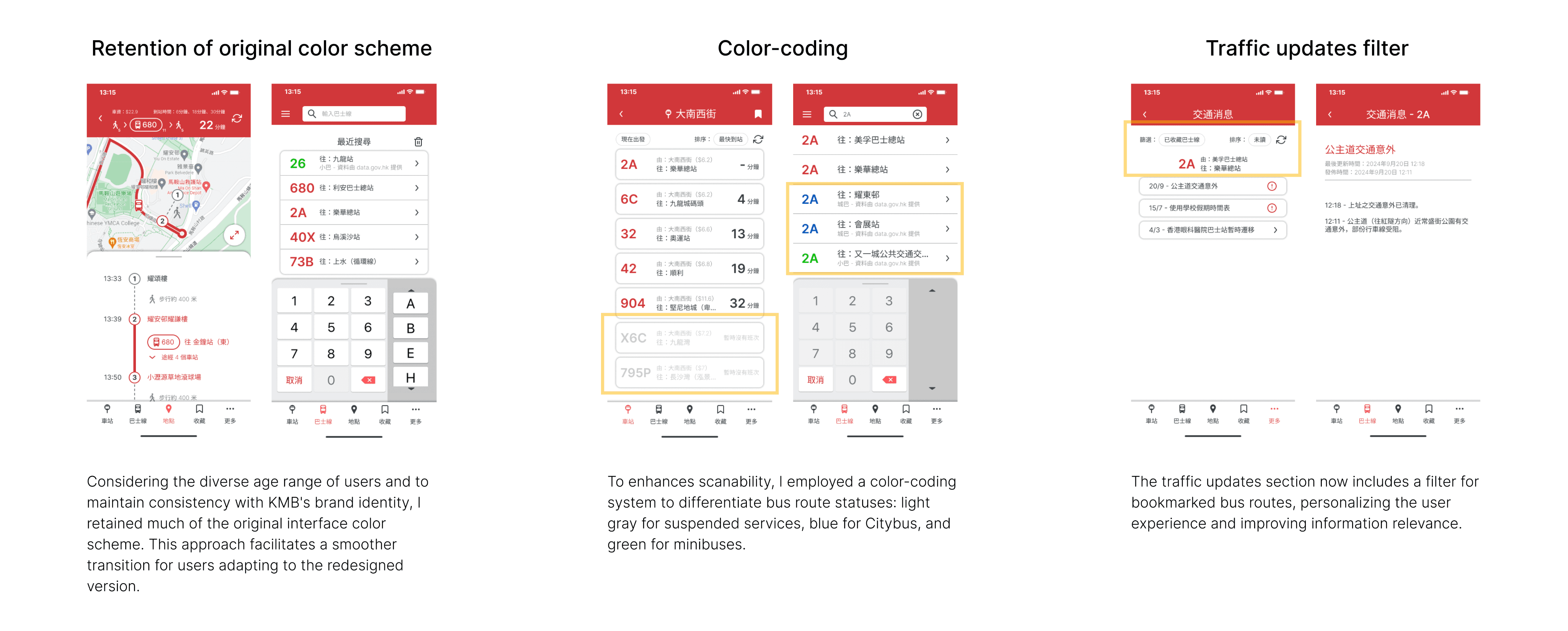
After conducting usability testing with the low-fidelity prototype, I carefully analyzed the feedback and observations. This crucial step allowed me to identify areas for improvement and validate successful design elements. With these insights in hand, I began the transition to high-fidelity mockups.
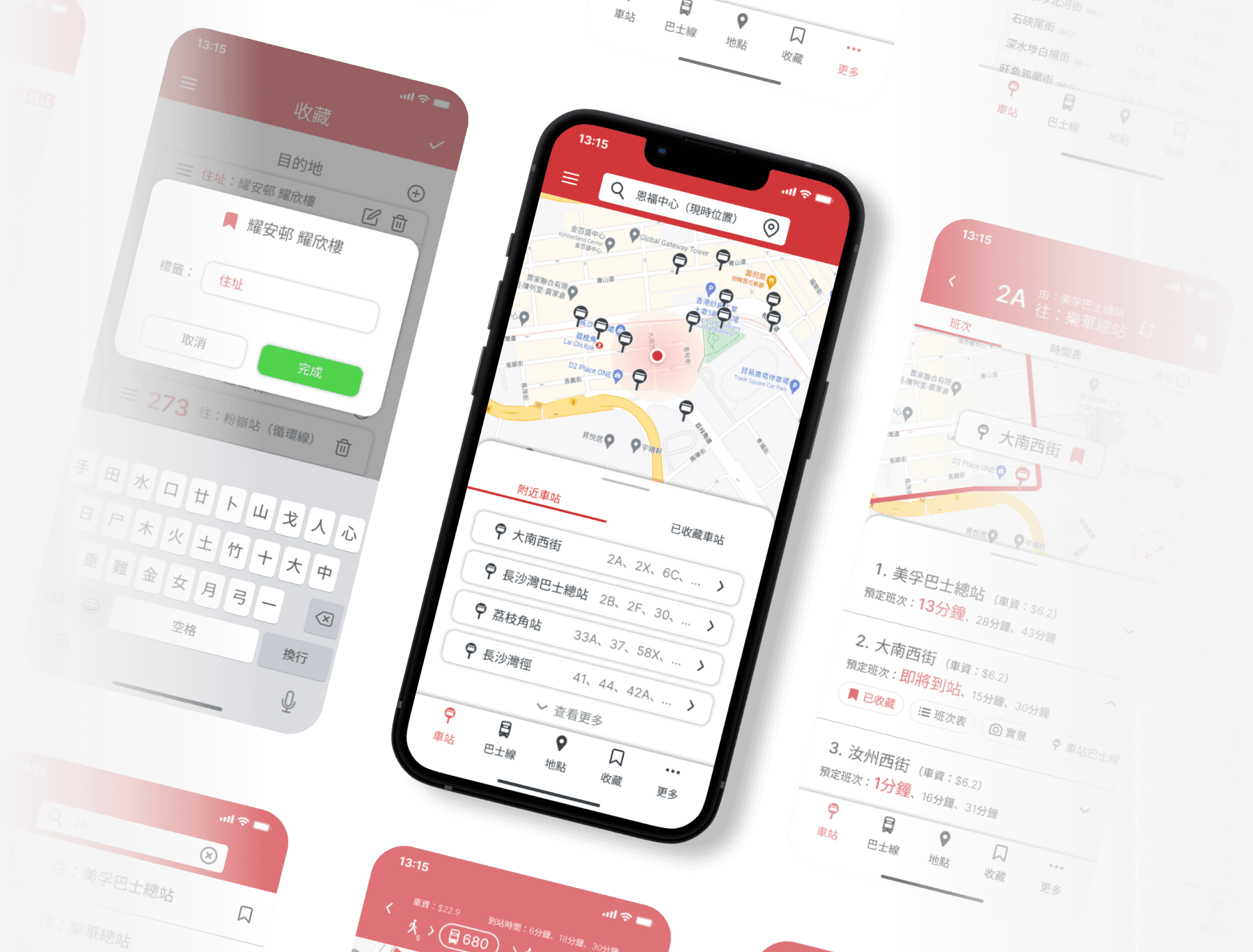
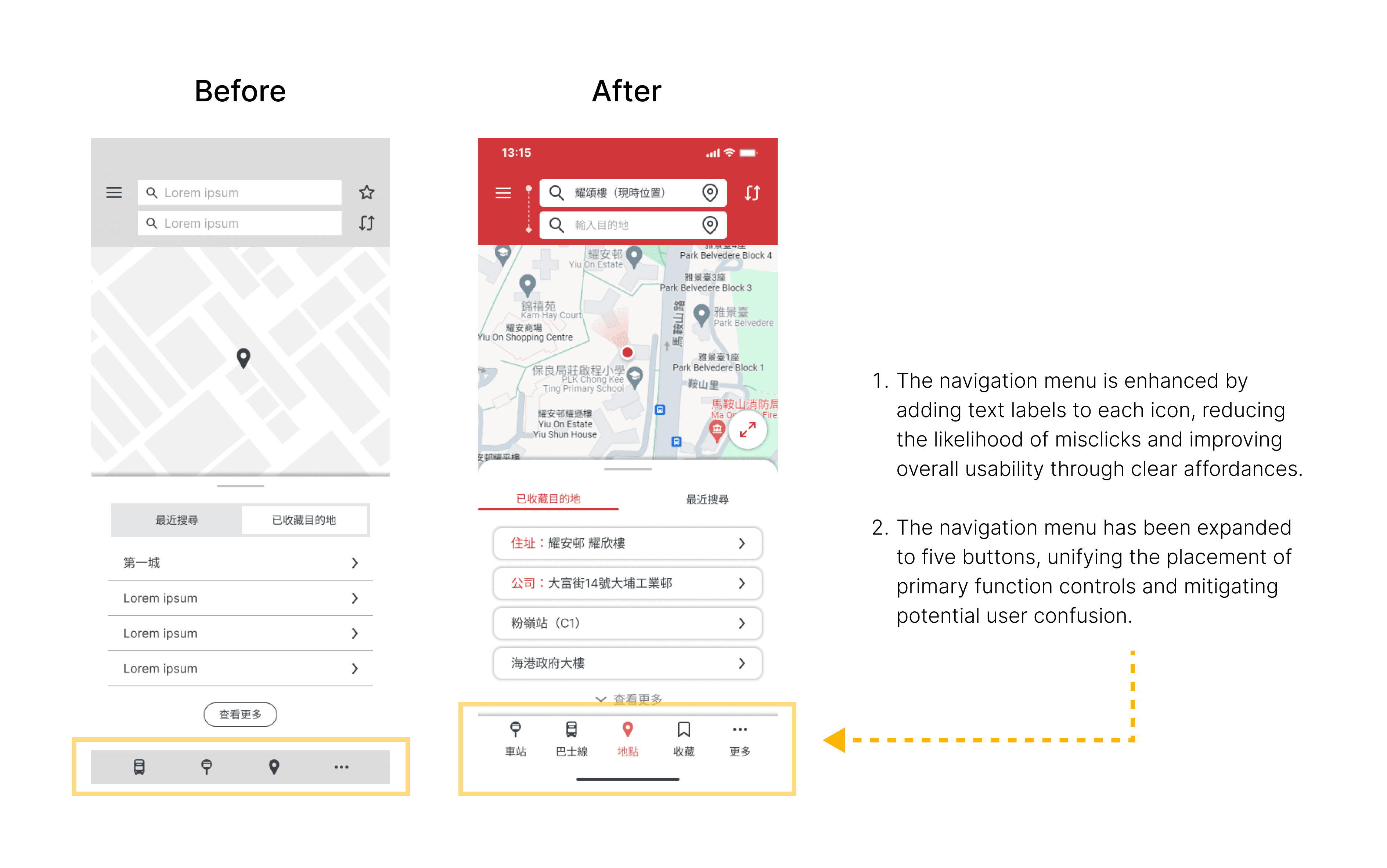
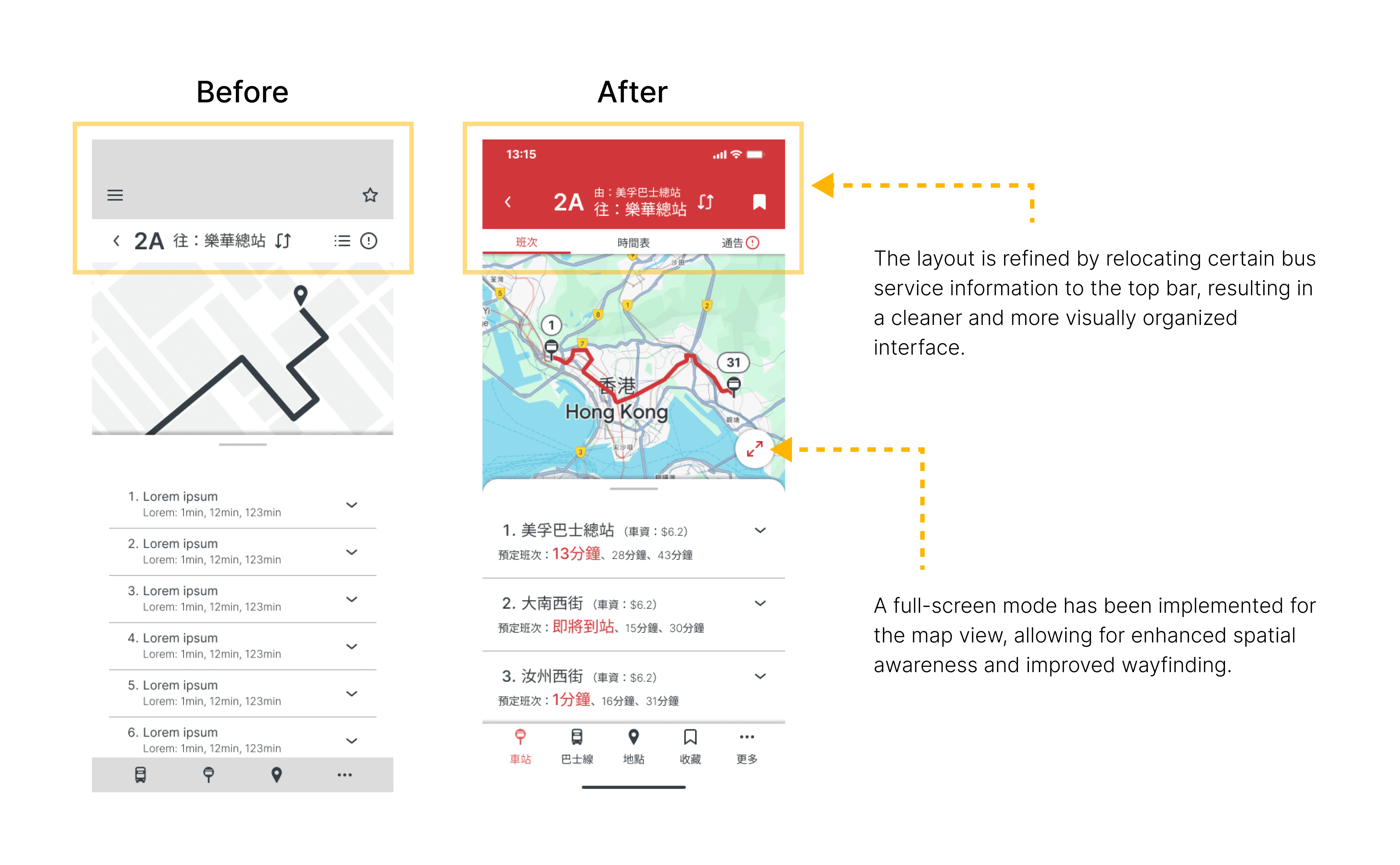
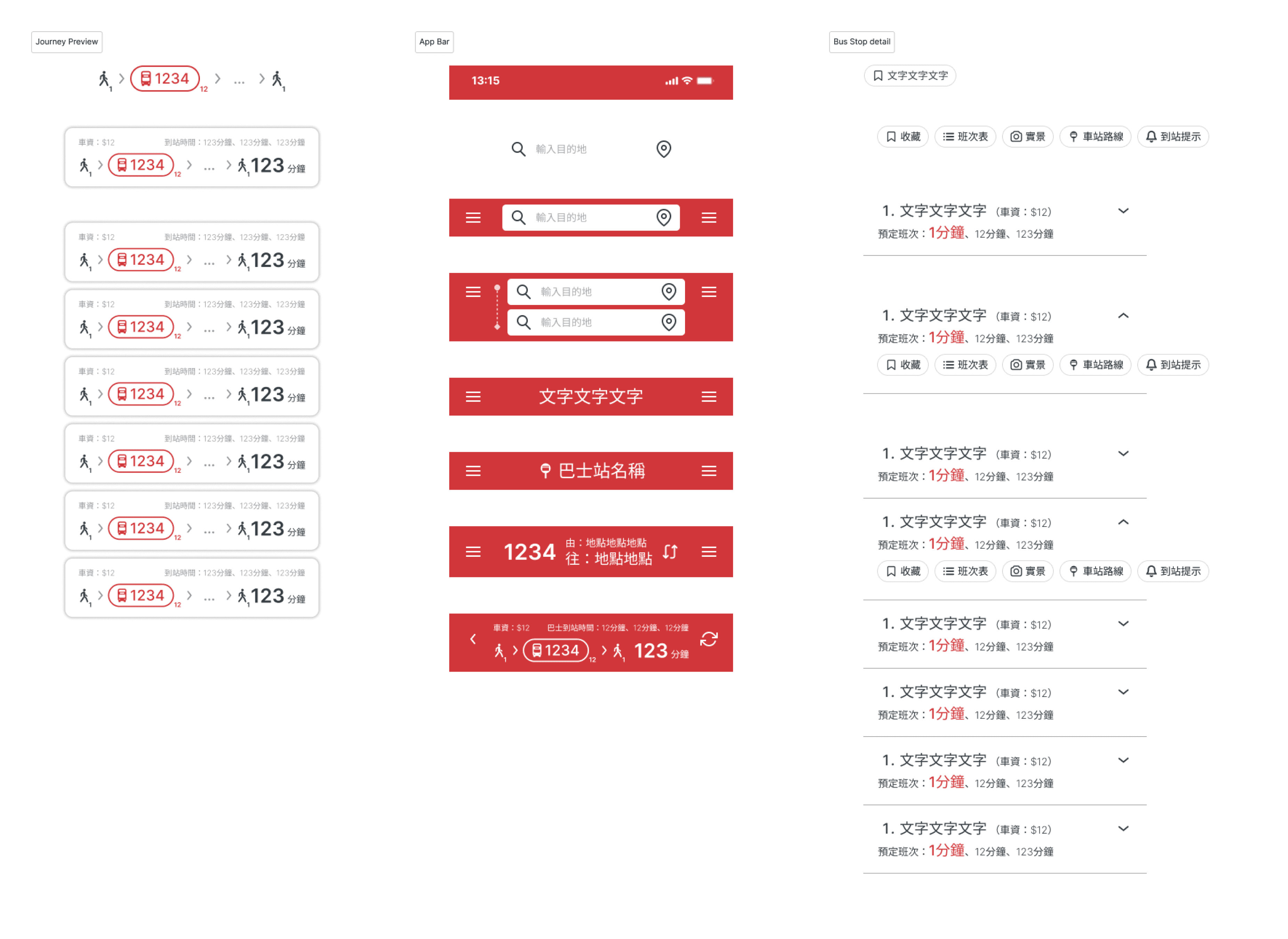
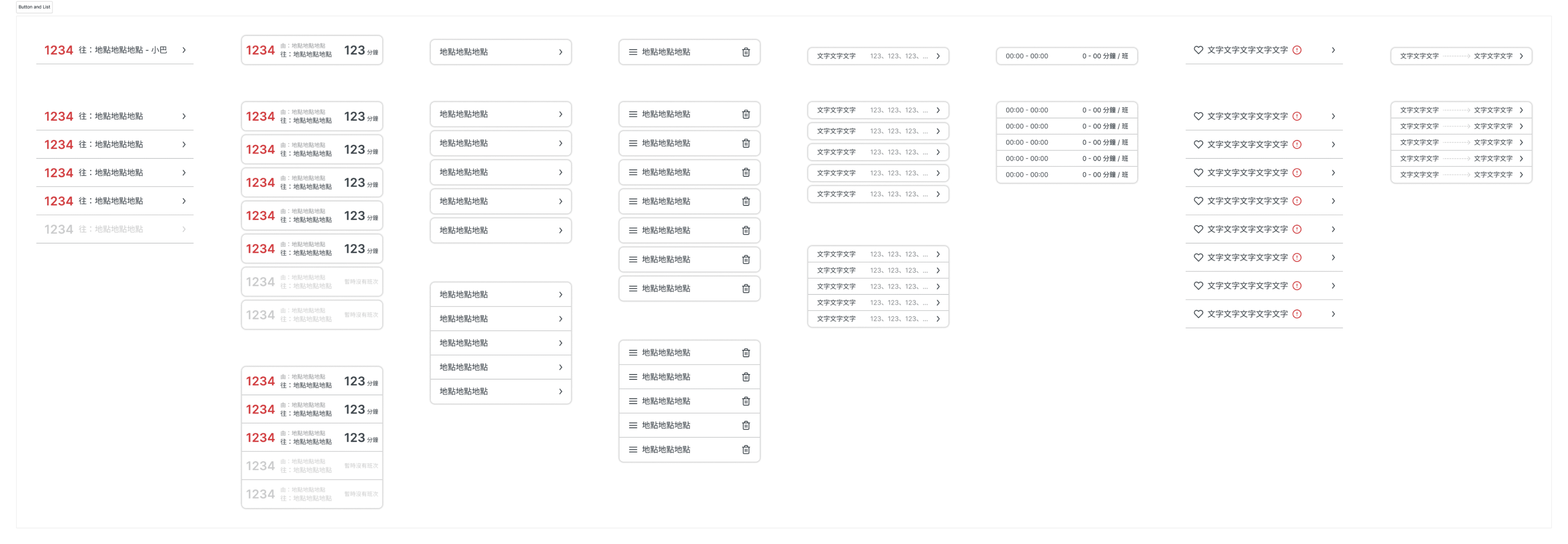
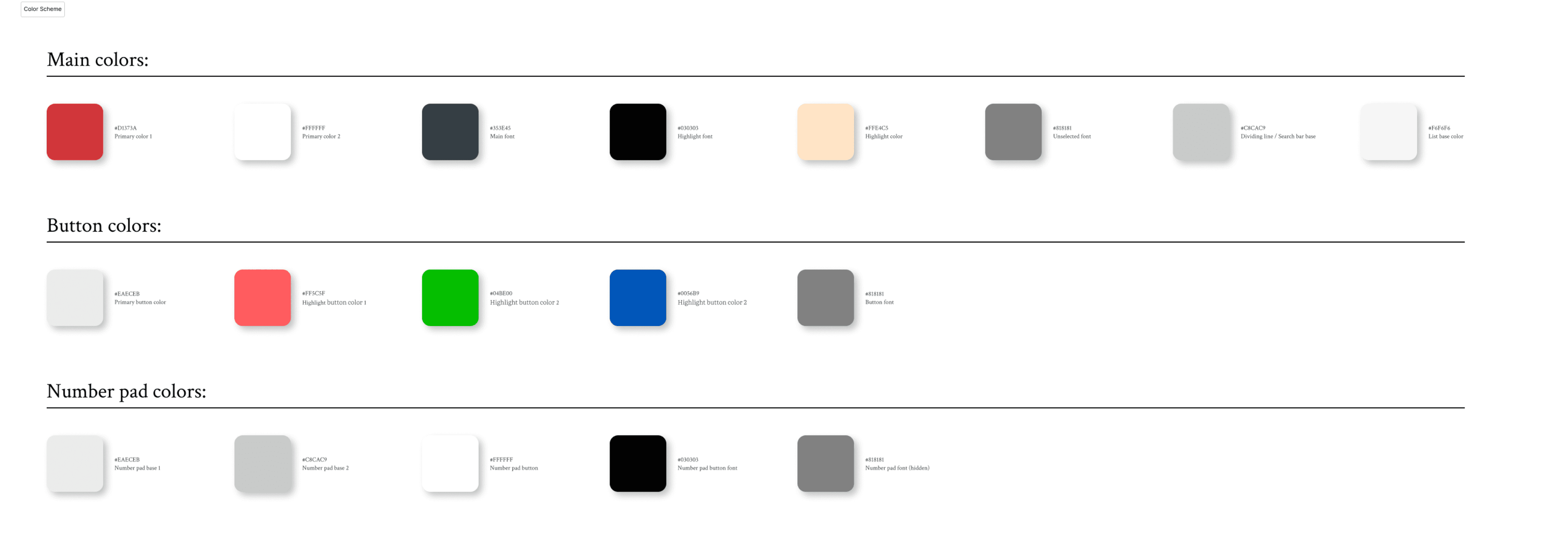
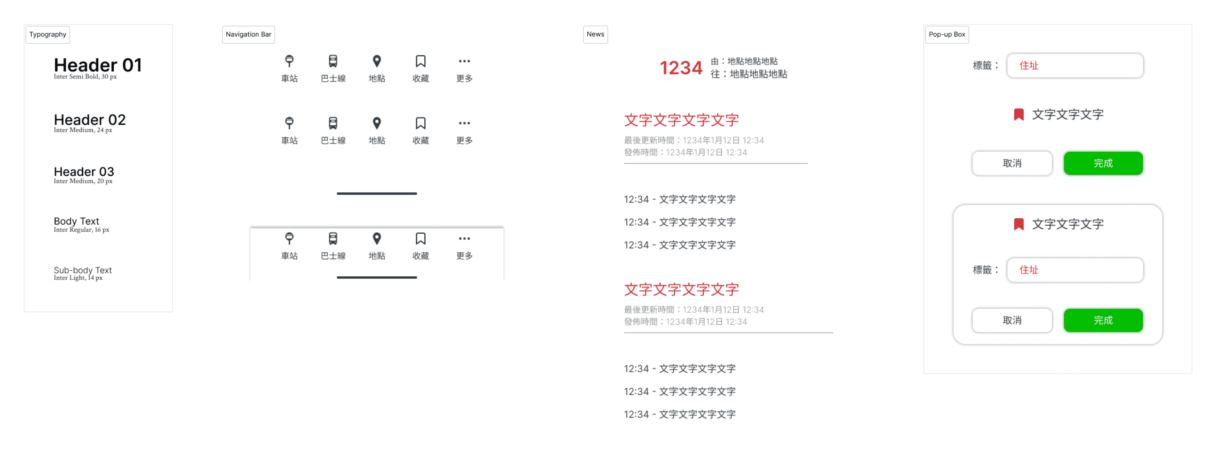
The mockups represent a significant leap in visual design and interactivity. Using Figma, I incorporated the App 1933's original brand colors and visual style guide to create polished, visually appealing screens. This stage involved refining the layout, adding detailed UI components, and ensuring consistency across all screens.
Key considerations during this phase included:
High-Fidelity Prototype
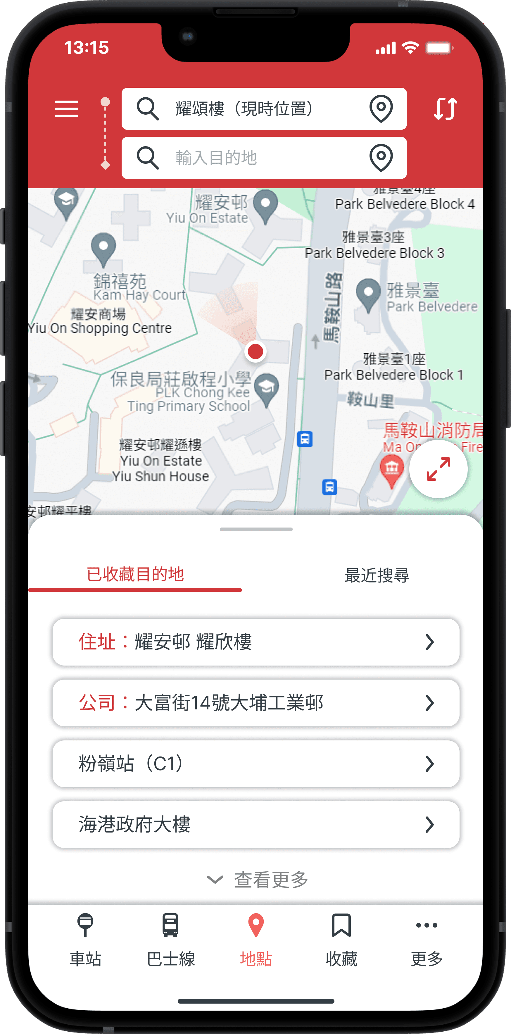
Once the mockups were complete, I assembled them into a fully interactive prototype. This high-fidelity prototype closely mimicked the intended final product, allowing users to interact with a near-final version of the app and thus provide valuable insights into the effectiveness of the redesign.
(For the best experience, please view the prototype on your mobile device. 📱)
Design Kit
Moderated Usability Testing
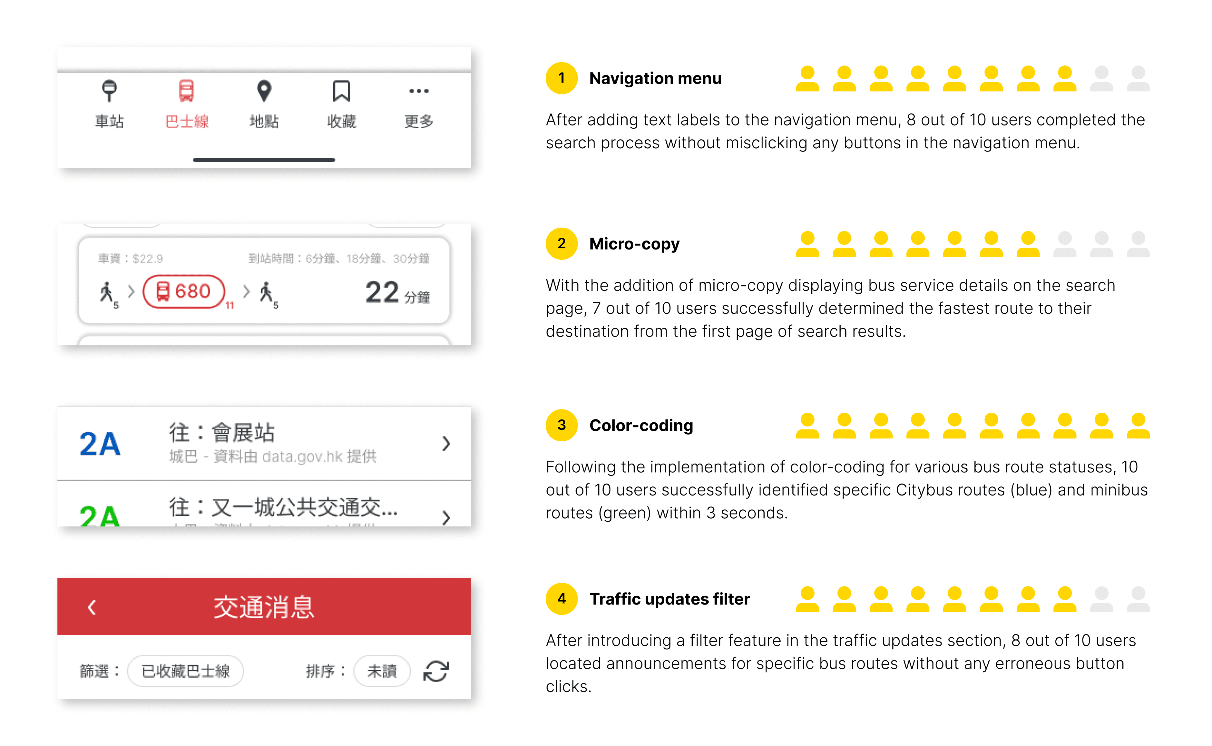
To validate assumptions and changes, I conducted usability testing of the high-fidelity prototype with 10 participants who didn’t participate in the previous low-fidelity prototype testing. I designed new tasks and monitored their completion time and steps via Zoom screen sharing. Post-task discussions were held to gather qualitative feedback.
The results of this usability testing were as follows:
Impact
A week after finalizing the design, I spontaneously engaged with friends and bus passengers who hadn't participated in any previous interviews. I demonstrated the high-fidelity prototype and invited them to try it. Their feedback was consistently positive:
Users were surprised by the extent of the redesign, noting that they hadn't imagined App 1933 could undergo such a significant transformation.
Despite the changes, users found the new functionality and search system familiar and easy to navigate.
Previously challenging tasks, such as searching, became notably easier in the redesign.
The feedback was highly encouraging as some users expressed eagerness for the redesigned version to be released. The redesign significantly altered users' existing impressions of App 1933.
(I welcome KMB to consider this redesign as a design reference. If the trial receives positive feedback, please acknowledge my contribution! If not, please let me know how I can further improve the design. 🤝)
Takeaways
Further Exploration
Given additional time and resources, I would propose the following future improvements:
Expert UX/UI Feedback:
Seek input from more experienced designers in the field to refine and enhance the overall design.Expand Feature Set:
Develop interfaces for additional functionalities, such as Notification preferences and user account features.Localization and Accessibility:
Create an English language interface and implement a night mode for improved visibility in low-light conditions.Cross-Platform Responsiveness:
Design a responsive layout suitable for tablet and laptop users, ensuring a consistent experience across devices.
Thank you for reviewing my work on the App 1933 redesign project!
“The iterative process never ends.” I would appreciate your thoughts and insights on this topic, as feedback is crucial to further enhancing the findings of this study. If you’d like to get in touch or see more, please connect me at henrychau050@gmail.com.
Let’s get in touch!

