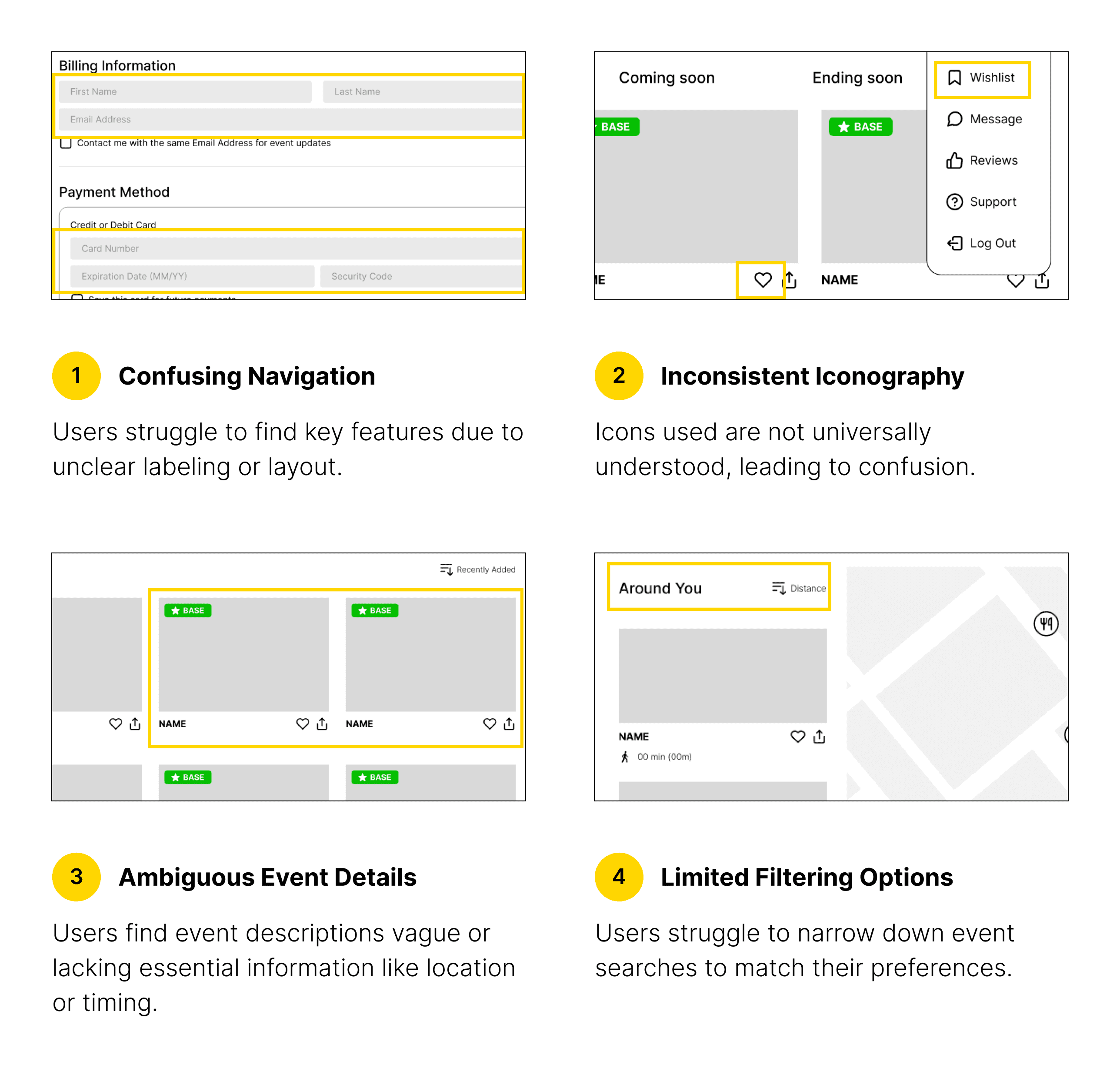
Challenges
Goal
To create a platform that consolidates all steps of itinerary planning into one seamless experience, allowing users to discover more travel enjoyment in Hong Kong. By integrating information about attractions, activities, shops, and restaurants, users can avoid the hassle of using multiple apps and complete all planning steps within a single app.
My Role
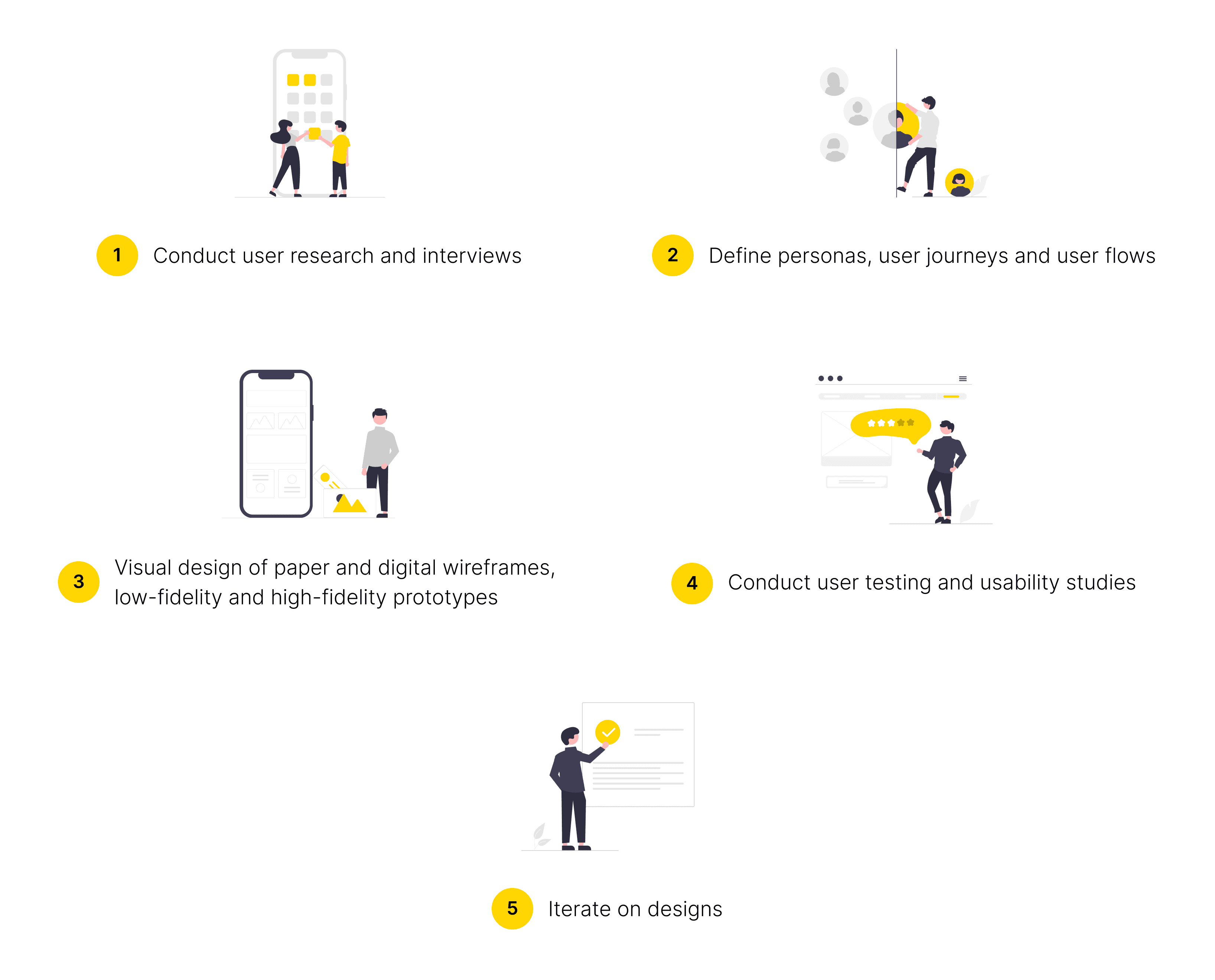
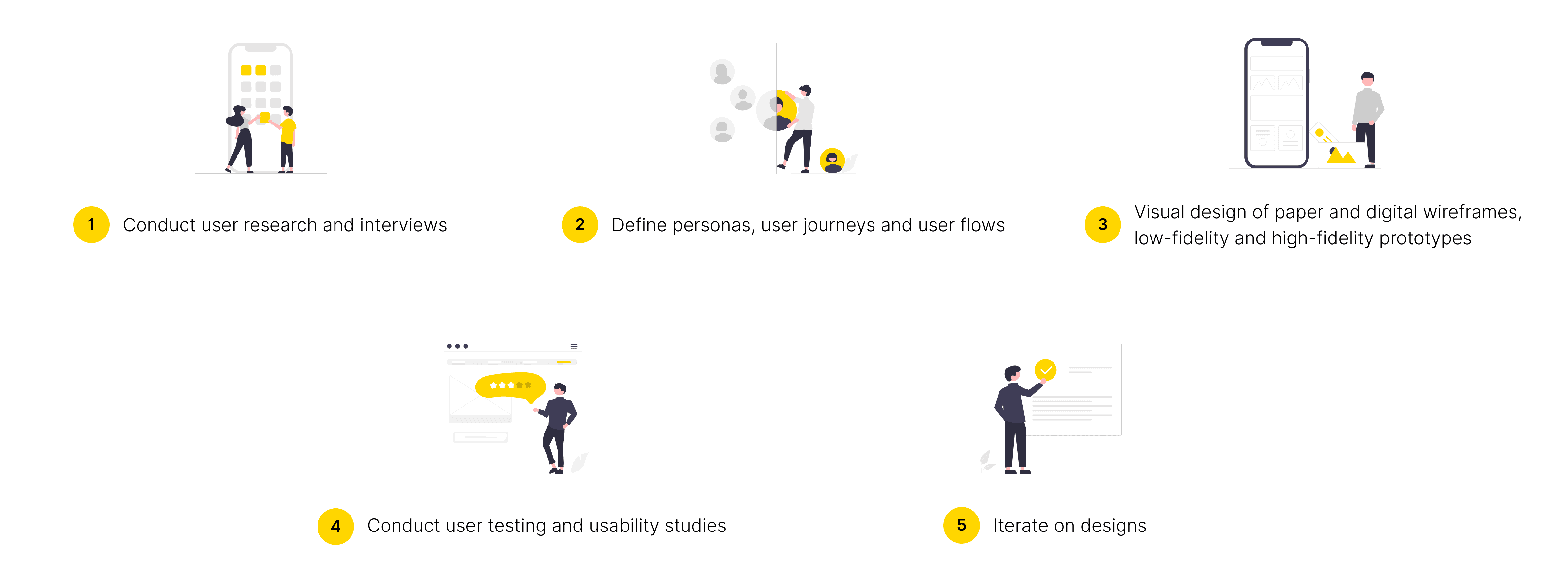
I am the sole UX designer leading this redesign project. I conceptualized the overall direction for the project, and then implemented each design enhancement step by step. Here are my responsibilities:
Design Process
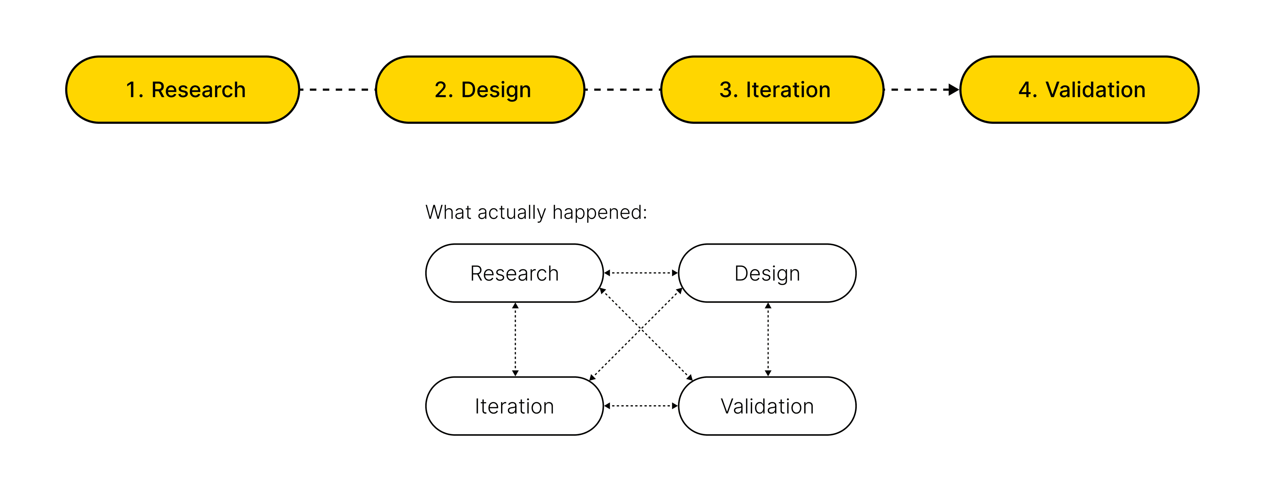
Research overview
I applied 3 research methods to understand the processes users go through to find their best route and their pain points during the process:
Competitive Studies
User Interviews - 15 interviewees
Online Survey - 30 participants
1
Competitive Studies
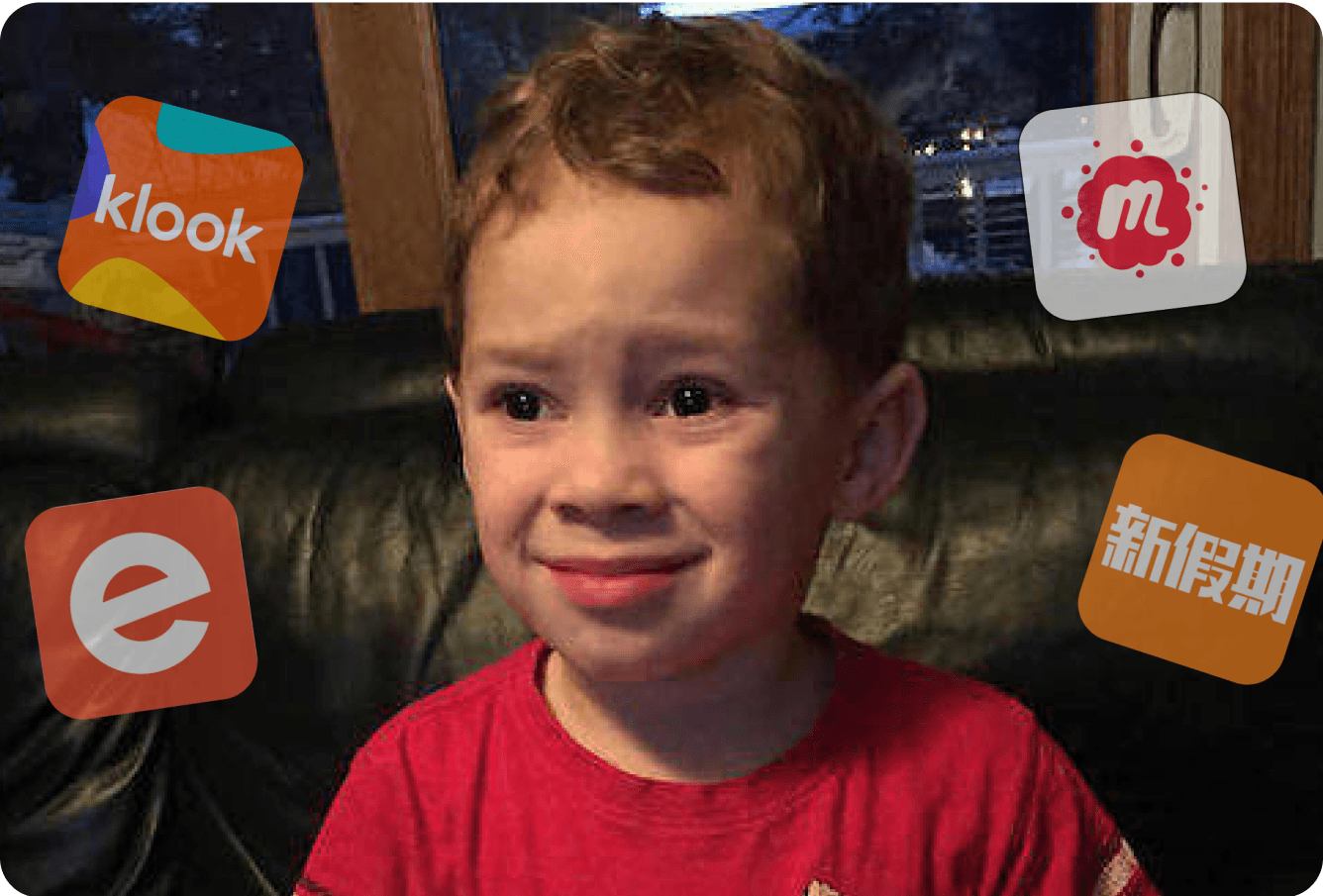
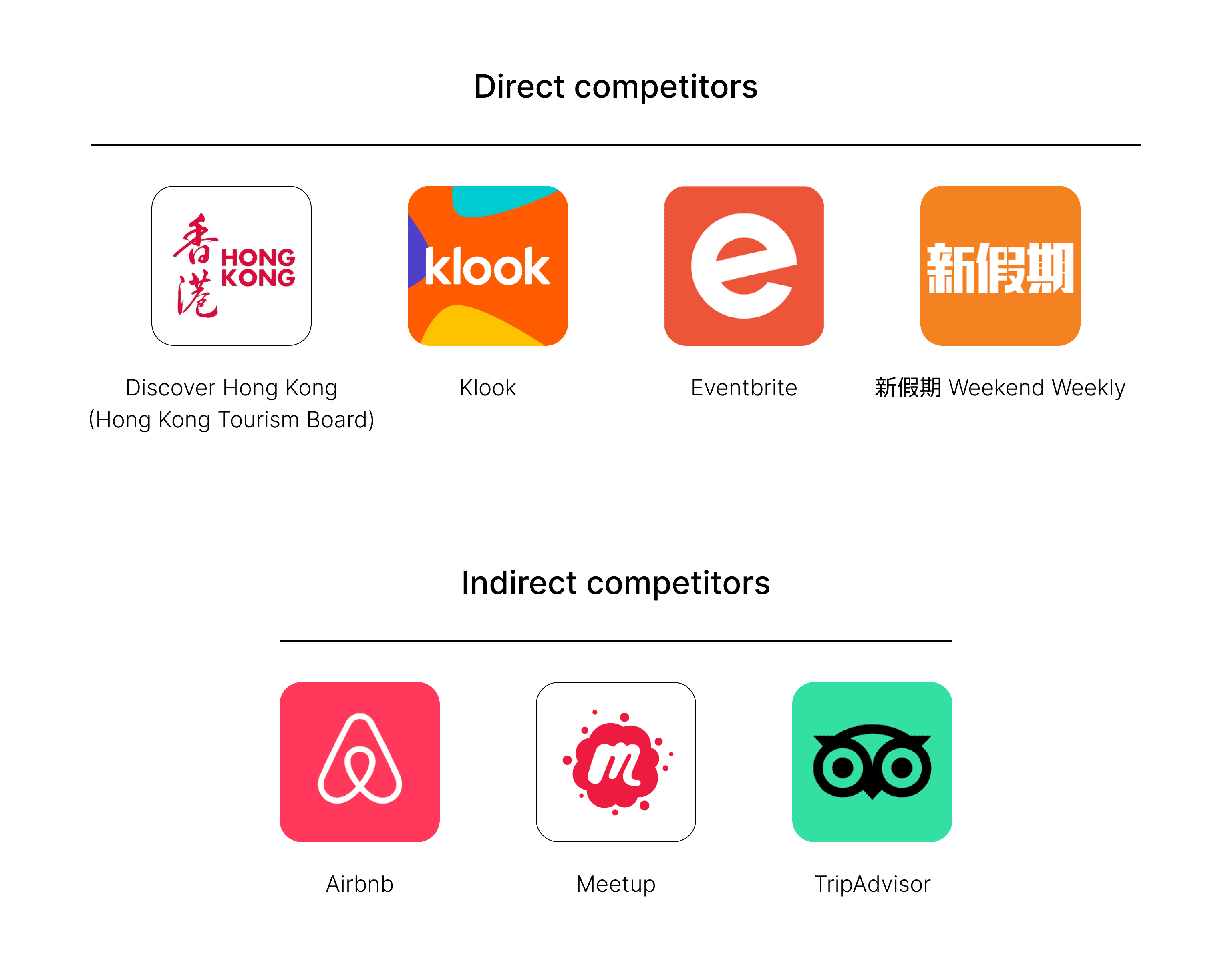
In developing the Competitive Studies for HK Hopper, I analyzed both direct and indirect competitors to understand the local event and attraction platform landscape. For direct competitors like Discover Hong Kong, Klook, Eventbrite, and 新假期 Weekend Weekly, I assessed their user experience, content offerings, and unique features, focusing on design aesthetics, navigation efficiency, and user engagement strategies.
I examined indirect competitors like Airbnb, Meetup, and TripAdvisor to pinpoint market gaps and innovative strategies for enhancing user experience. By synthesizing these insights, I aimed to position HK Hopper as a unique, user-centric solution for locals and tourists wanting to engage with Hong Kong's vibrant culture and events.
Here’s the link to the summary of my analysis.
2
User Interviews
Sample size: 15 interviewees
Target participants: Potential users of HK Hopper, aged 18 and above, diverse in gender and occupation (including students, working professionals, and travelers)
Common characteristic: Individuals who have experience planning trips or attending events in Hong Kong
Interview focus: Gathering qualitative insights on travel planning habits, preferences, and specific needs; identifying pain points related to current travel planning tools; and exploring desired features for an ideal travel app
Format: One-on-one interviews conducted via Zoom
3
Online Survey
Sample size: 30 participants
Target audience: Similar to User Interviews
Purpose: To gather a wider range of data for analyzing user behaviors and preferences related to travel planning
Structure: Combination of qualitative and quantitative questions to provide a well-rounded understanding of user experiences
Format: Short and straightforward questionnaire to facilitate quick responses and enhance participation rates
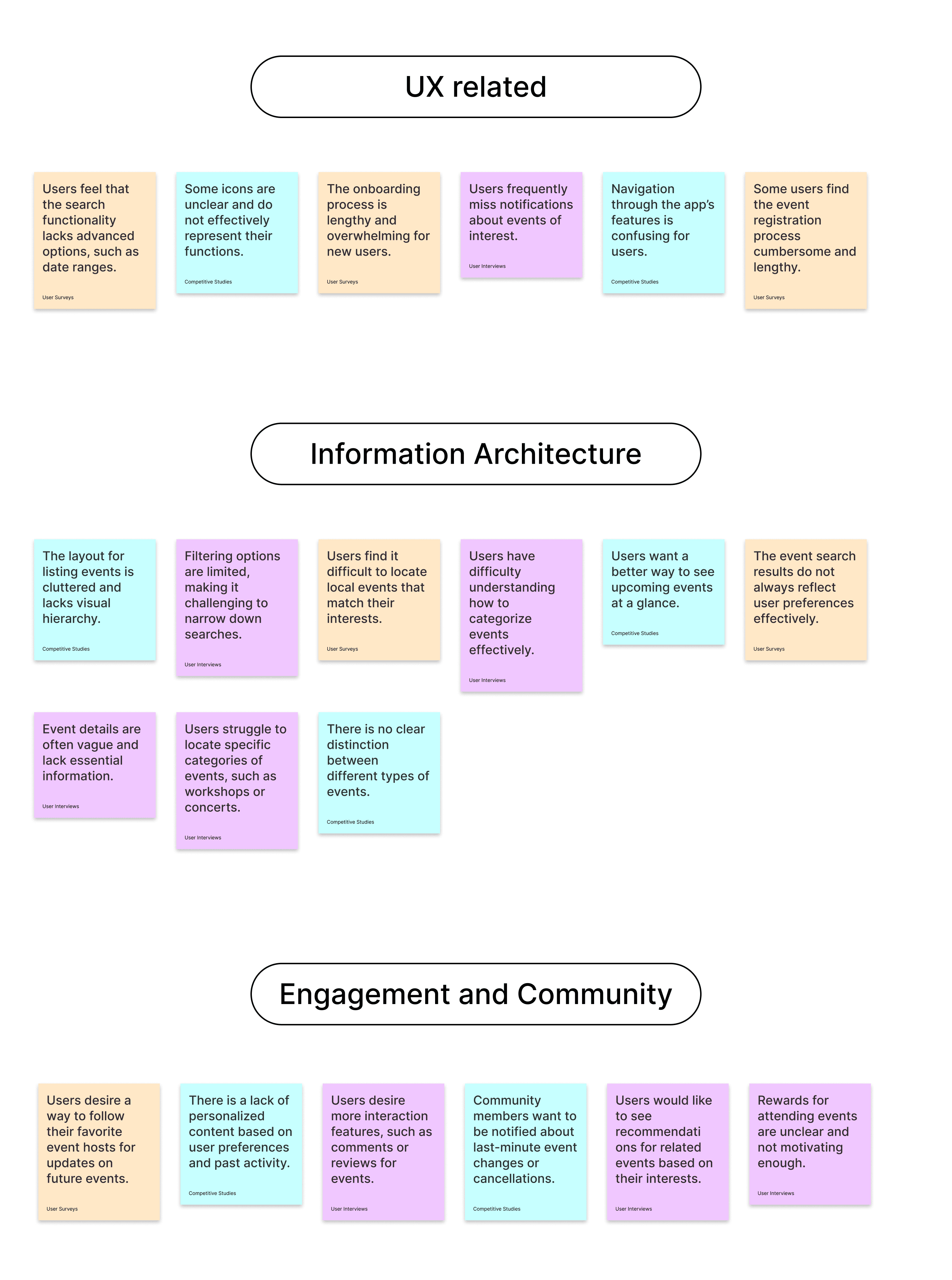
Affinity Diagram
To synthesize findings from the 3 research methods into actionable project directions, I categorized all findings into 3 main groups to avoid redundancy and maintain clarity. Here is the refined Affinity Diagram with structured insights:
Key research insights
Fragmented Information:
Users generally use two to three different apps to plan each of their trips or activities. They experience frustration with fragmented information across multiple platforms, making it hard to find local events and attractions.Missed Opportunities:
Users lack timely updates about events, which leads to missed opportunities for participation.Navigation Challenges:
Users have difficulty navigating to nearby events due to inadequate location-based search options. They hope to view nearby attractions or ongoing activities based on their current location.Desire for Personalization:
Users desire personalized experiences, as many feel that generic recommendations do not meet their interests.
Unexpected research findings
Mobile Usage Insights:
Users often rely on mobile apps for spontaneous outings, highlighting the importance of a user-friendly and responsive design for quick access and seamless navigation.Community Engagement:
There is a potential for HK Hopper to foster a community around local experiences, enhancing the app's value beyond just event discovery.
Research summary
These insights highlight several critical areas for improvement in the traveling experience:
Streamlining the process of discovering local events and attractions, eliminating the need for cross-platform searches.
Keeping users informed and engaged with event and promotion notifications via messaging.
Enhancing exploration with a visual tool for locating attractions and events based on location.
Improving relevance by offering customizable preferences for event suggestions.
Simplifying itinerary planning with a feature for managing personal and HK Hopper events.
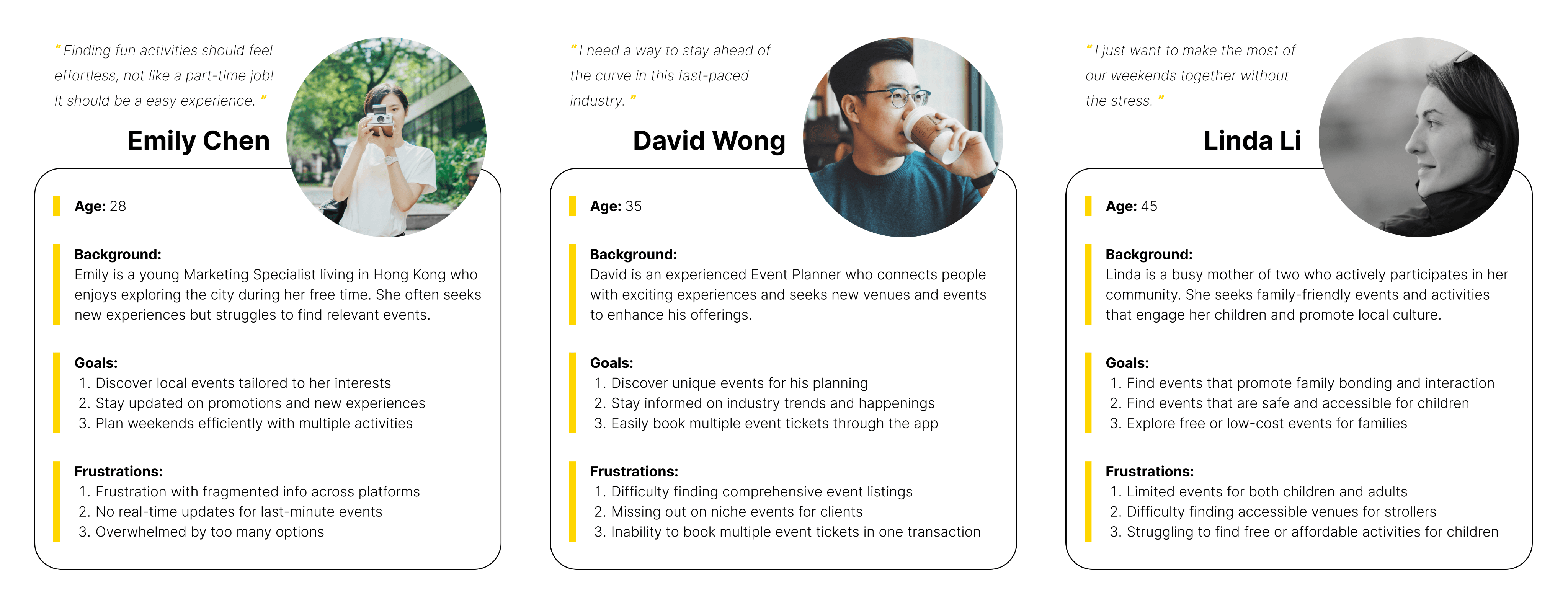
Personas
After gathering and analyzing research insights, the next step is to synthesize this data into representative user personas. This process involves identifying patterns in user behaviors, goals, pain points, and preferences across the collected data. The purpose of creating personas is to distill the research findings into archetypal users that embody the key characteristics and needs of the target audience.
Sitemap
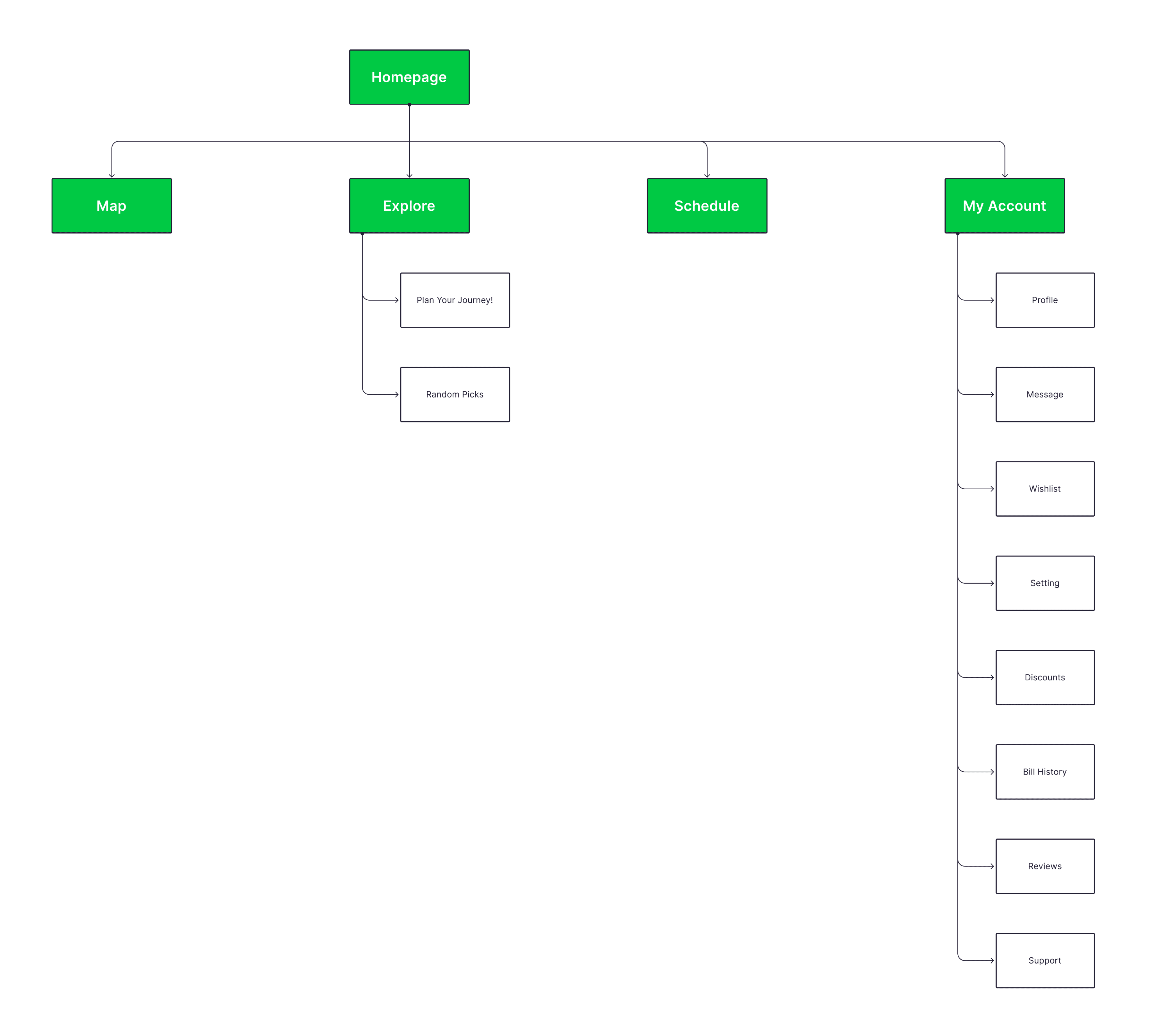
Since travel apps contain a vast amount of information on attractions and events, simplicity in functionality is key to avoid overwhelming users. The main navigation is divided into two search methods: Map and Explore, while the Schedule allows users to easily view their planned or registered activities.
Upon first launch, users will encounter an Initial Questionnaire that includes account creation and interest setup. Based on their preferences, personalized recommendations will be provided. Users who prefer to explore HK Hopper before creating an account can skip the questionnaire and later set up their profile and interests in the My Account section.
Paper Wireframes
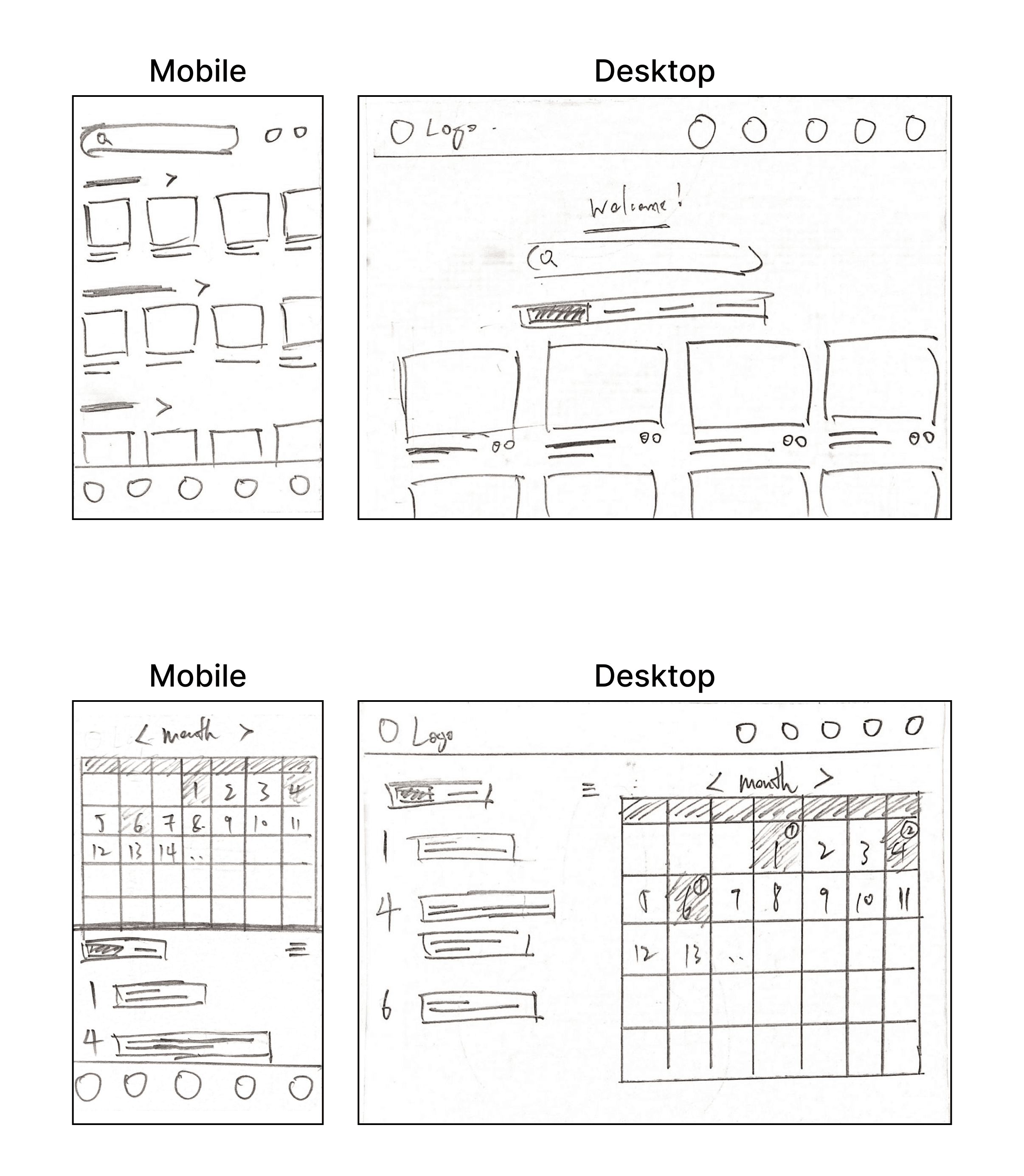
The development of paper wireframes for HK Hopper began with a focus on creating a clear and intuitive user experience across both desktop and mobile platforms. This initial phase involved sketching out the app's key screens and interactions, allowing for quick iterations and feedback. (With these rough hand-drawn sketches, it's clear that I've become a faster and more advanced sketcher since completing the App 1933 Redesign! 😂)
The app aimed for consistent functionality and aesthetics across devices. I focused on element adaptation for different screen sizes to ensure seamless navigation and easy content access. By prioritizing user journeys in the wireframes, I laid a solid foundation for enhancing usability across all platforms.
Digital Wireframes
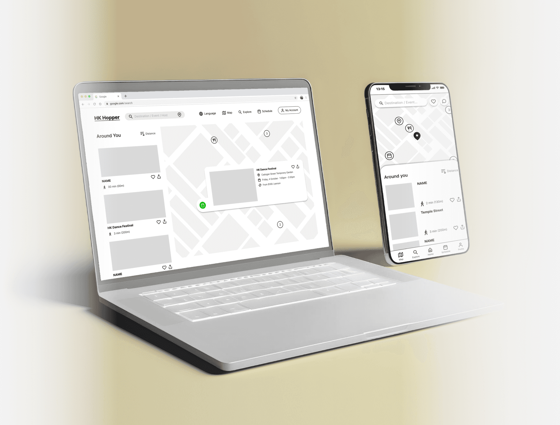
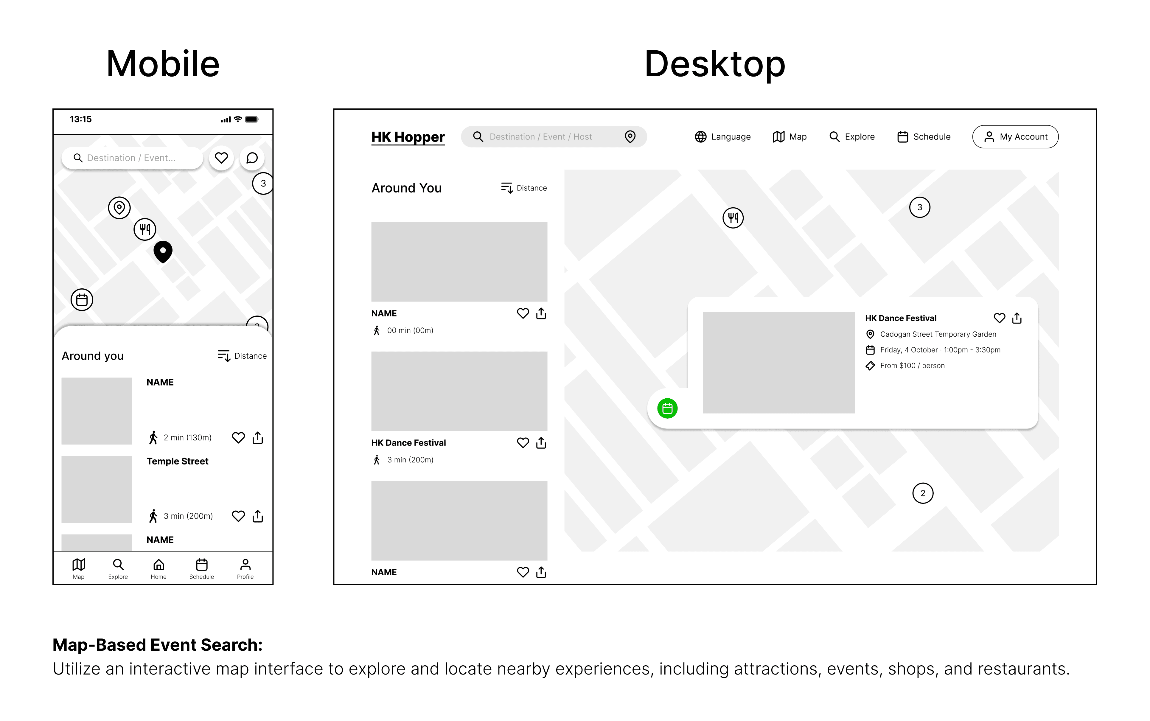
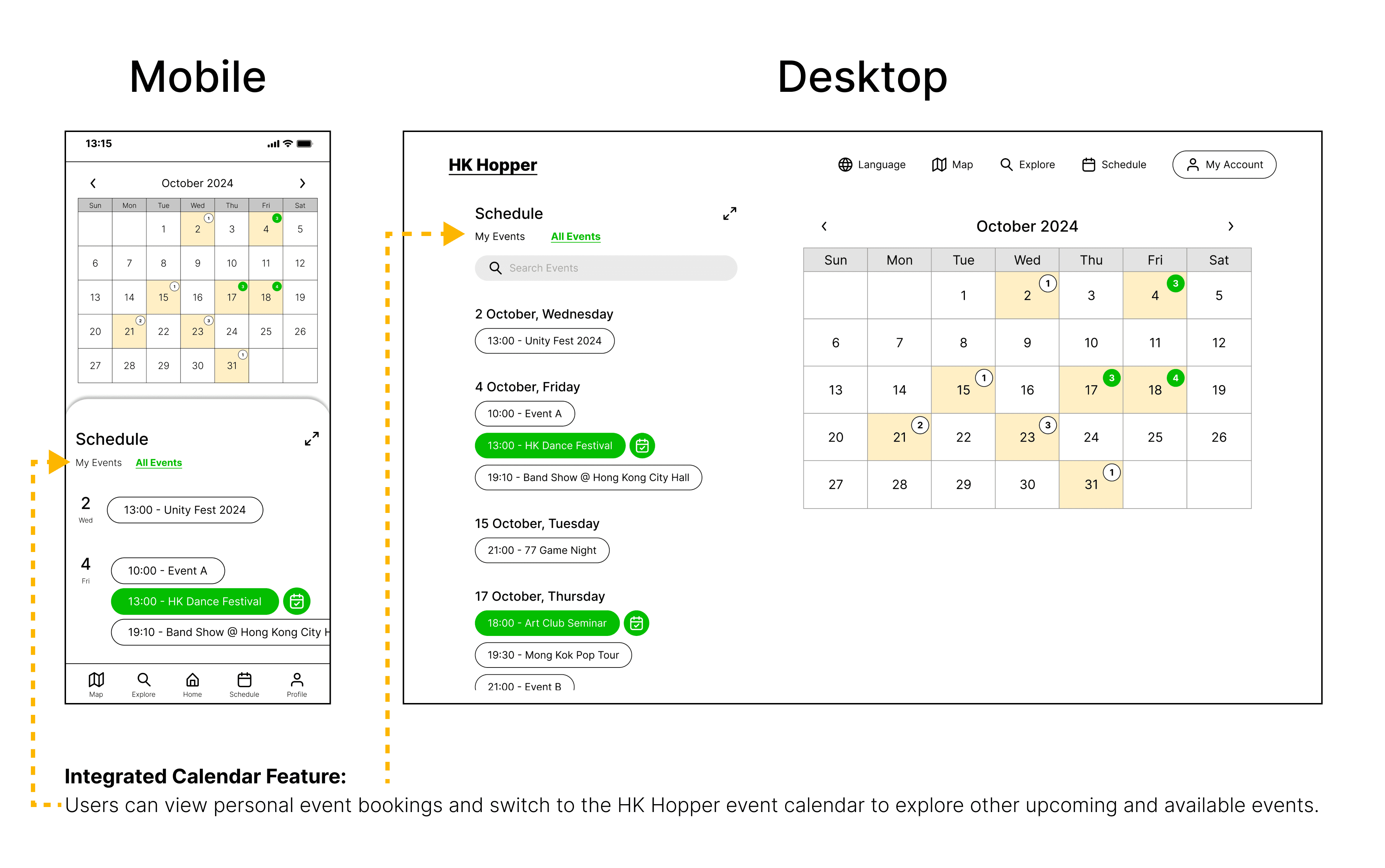
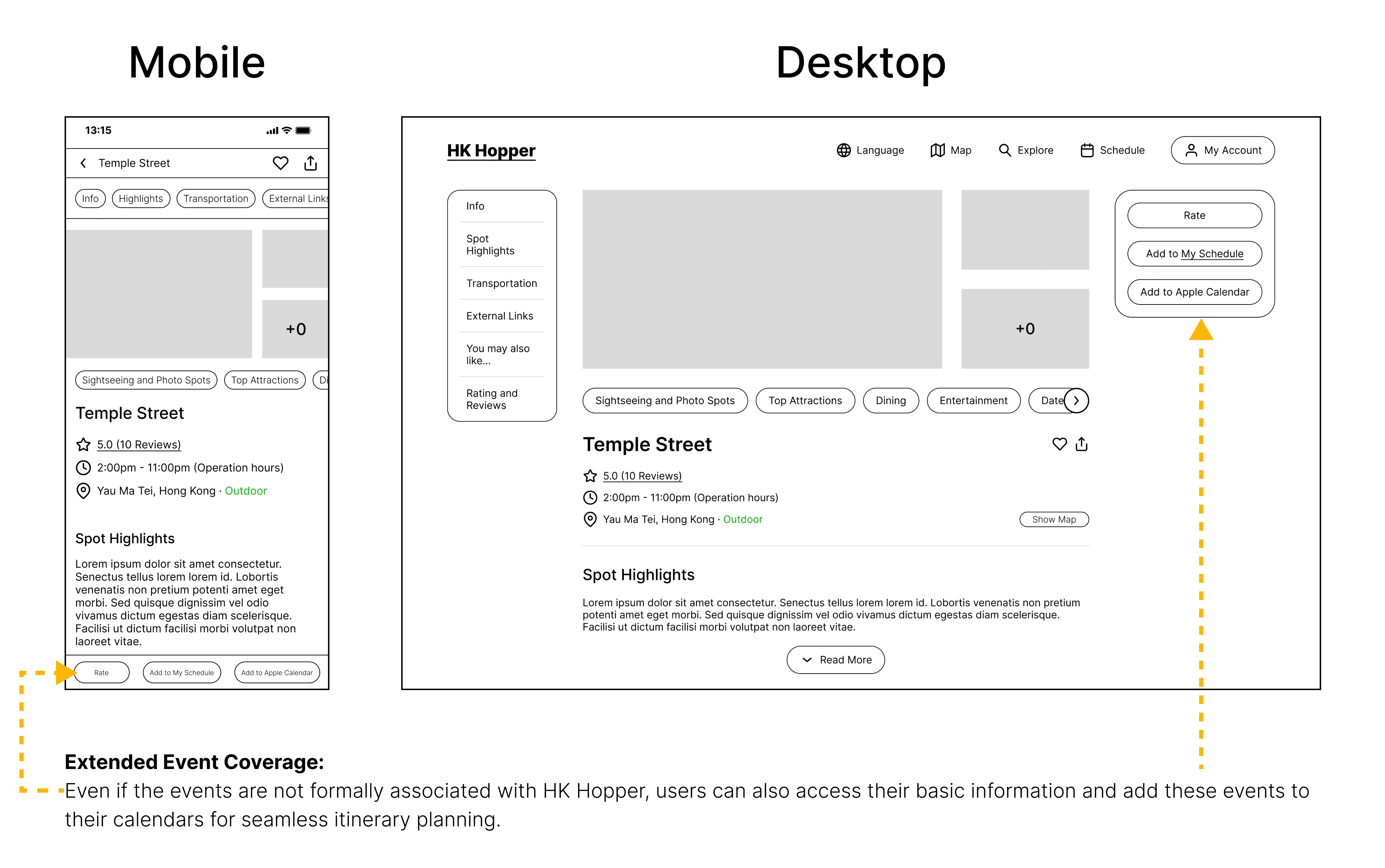
After the paper wireframe phase, I moved to digital wireframes for HK Hopper, enabling a detailed visualization of the app's structure and user interactions. This phase prioritized layout consistency and visual hierarchy while maintaining a user-centric approach to ensure clarity and ease of use on both desktop and mobile platforms.
Check out the following design concepts:
Low-Fidelity Prototype
Alongside the digital wireframes, I created low-fidelity prototypes to refine user interactions and gather feedback. These prototypes simulated the app experience, showcasing key features and navigation paths. Usability testing with potential users provided valuable insights that informed design adjustments, enhancing the overall user experience and addressing usability concerns before moving on to high-fidelity prototypes.
(For the best experience, please view the prototype on your laptop or desktop. 💻)

User feedbacks from Usability Testing
Mockups
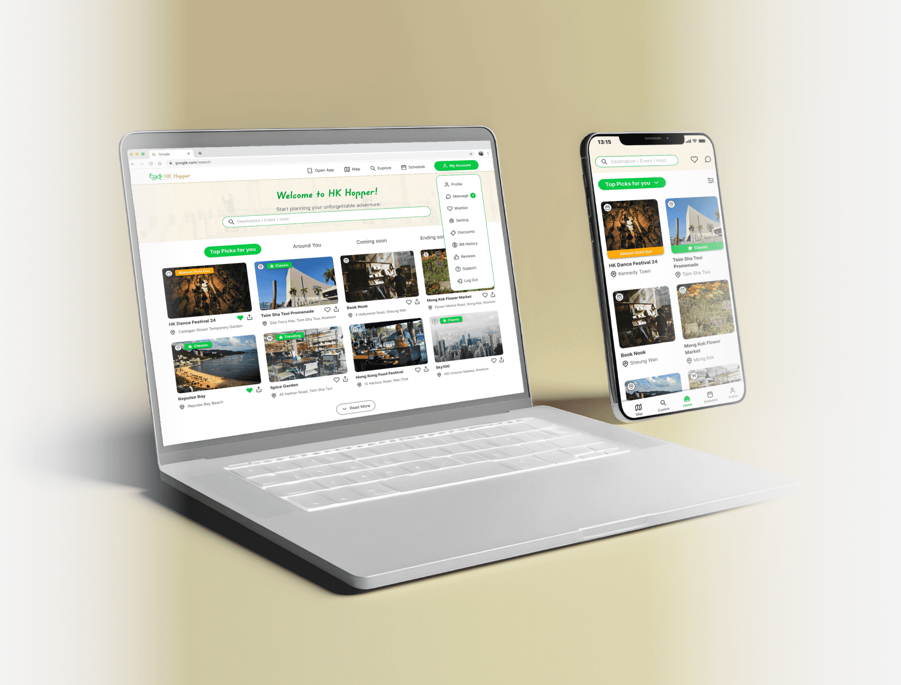
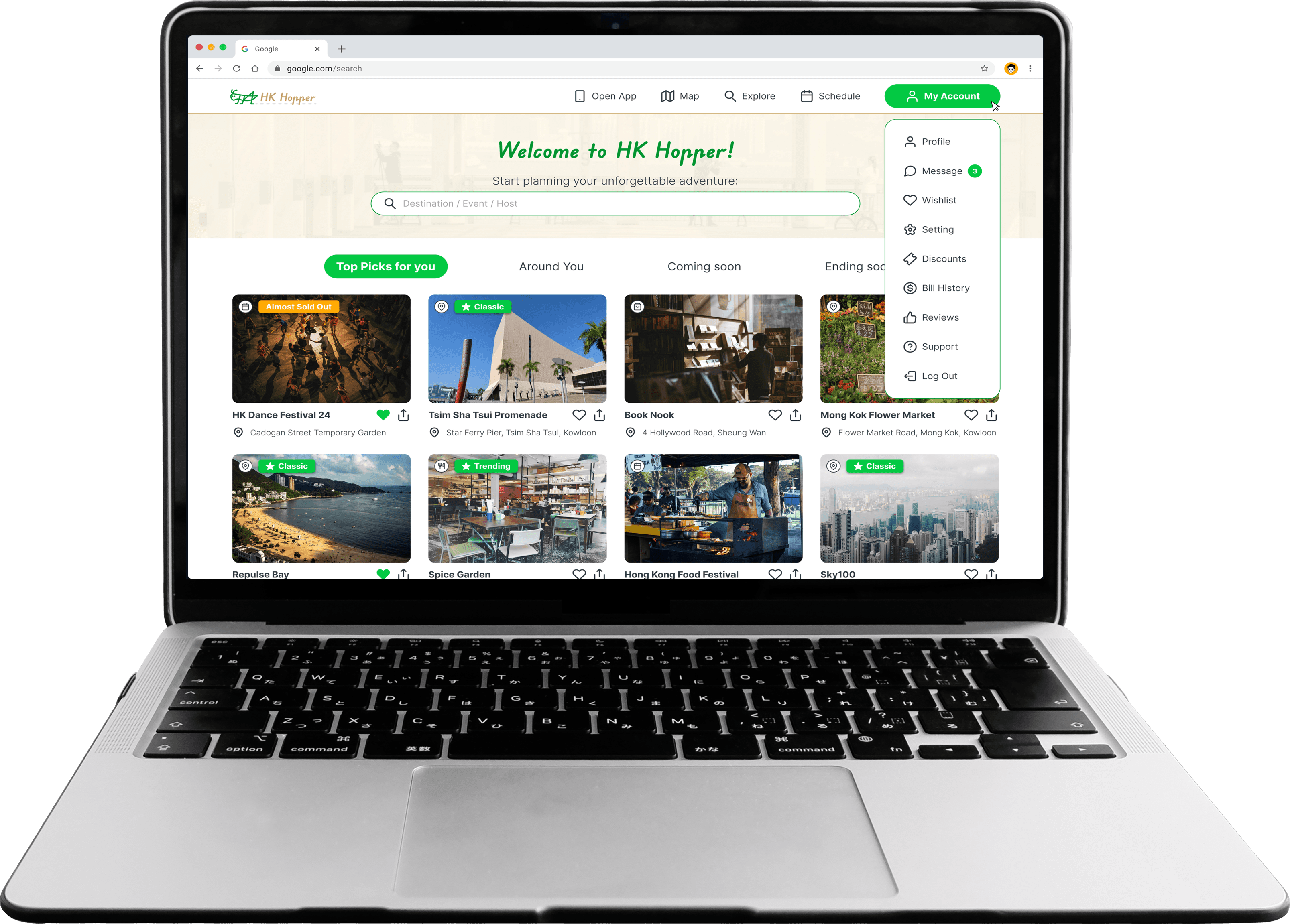
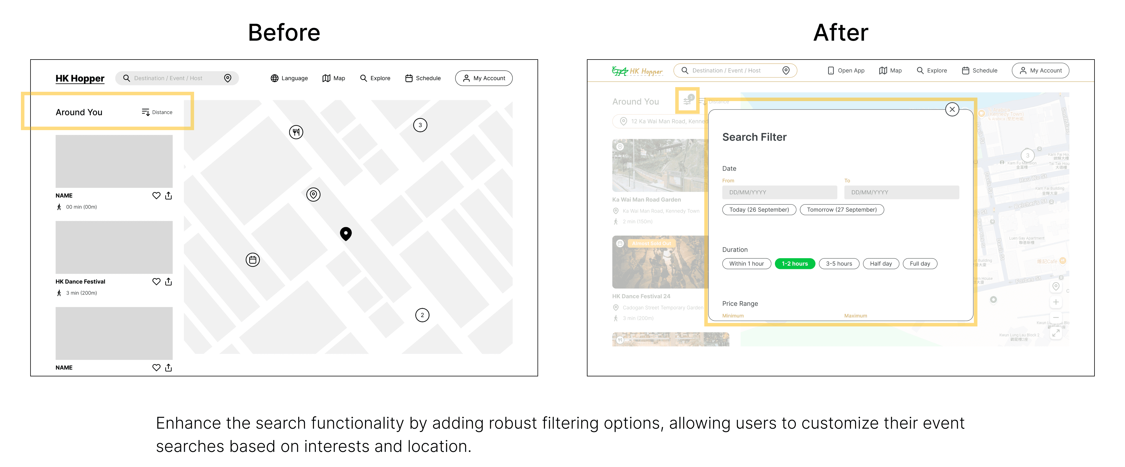
The process of developing mockups for HK Hopper involved translating the digital wireframes into visually rich representations of the app. This stage focused on refining the visual design elements, including color schemes, typography, and imagery, to create a cohesive brand identity.
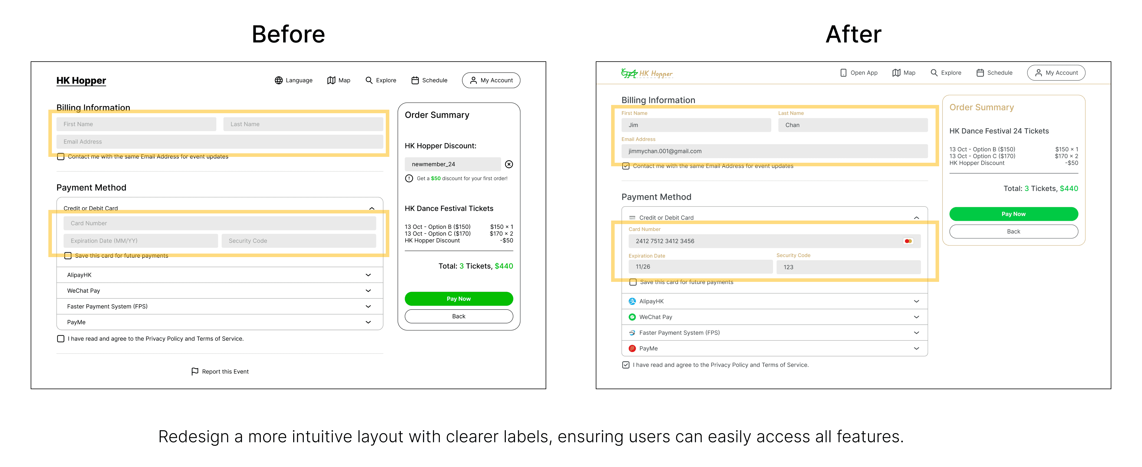
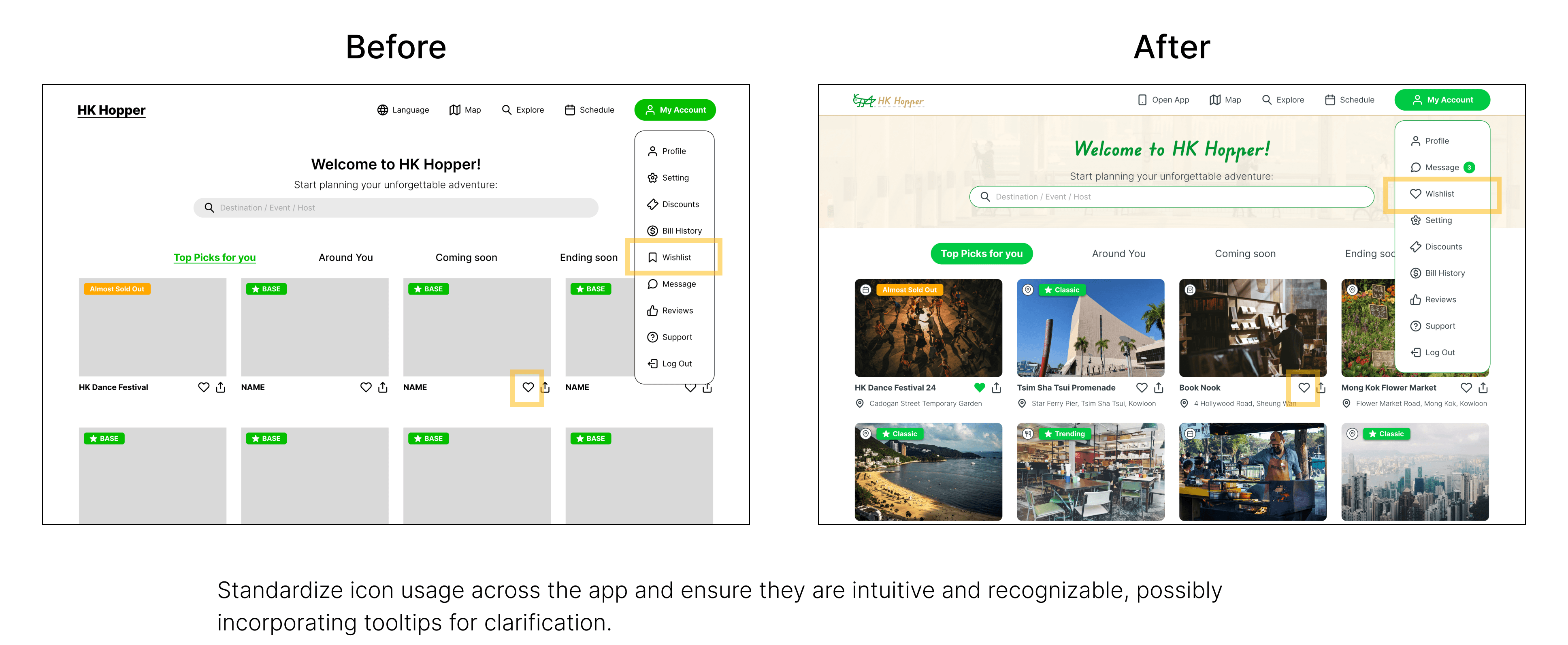
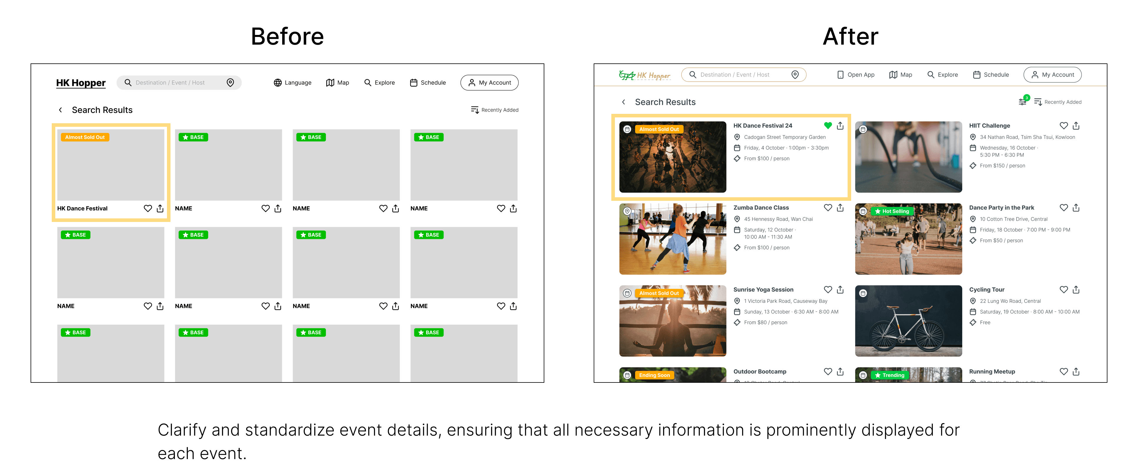
Meanwhile, transitioning from digital wireframes to mockups required careful consideration of user feedback and design principles. I revisited the initial wireframes to assess usability and aesthetic appeal.
Key redesign considerations included:
High-Fidelity Prototype
The development of high-fidelity prototypes marked a significant advancement in the design process for HK Hopper. I transformed the mockups into fully interactive prototypes that closely resembled the final product.
(For the best experience, please view the prototype on your laptop or desktop. 💻)
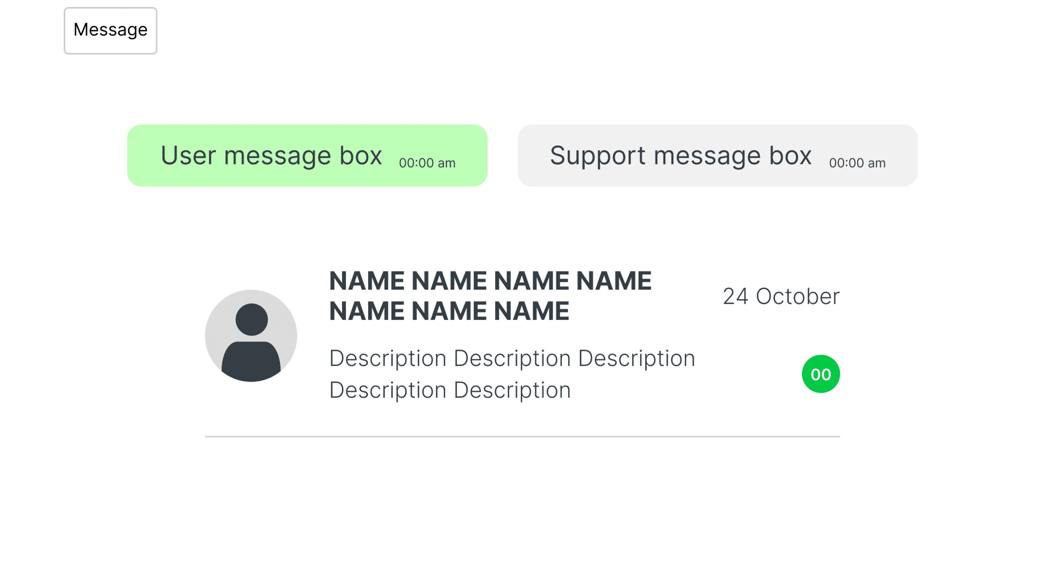
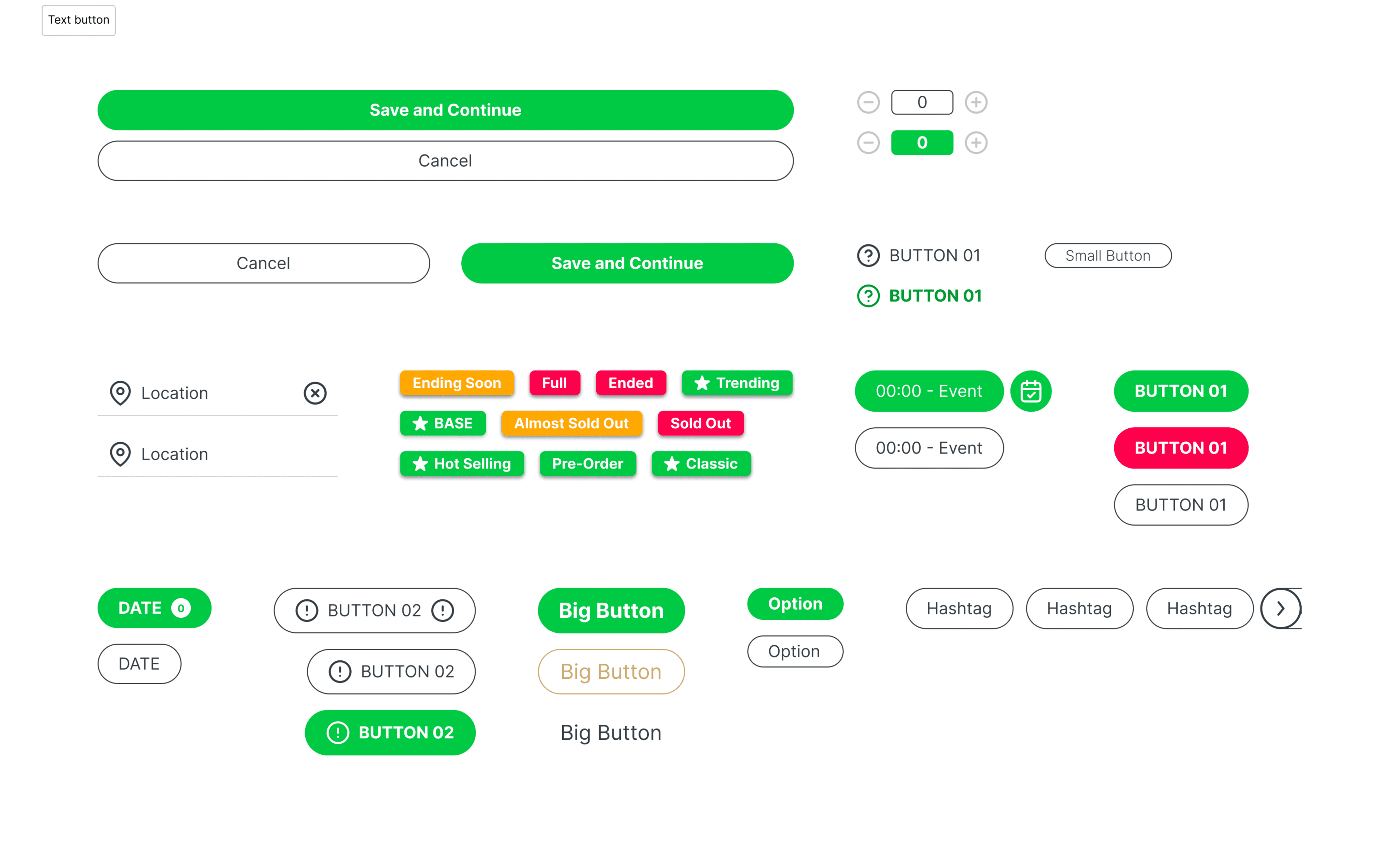
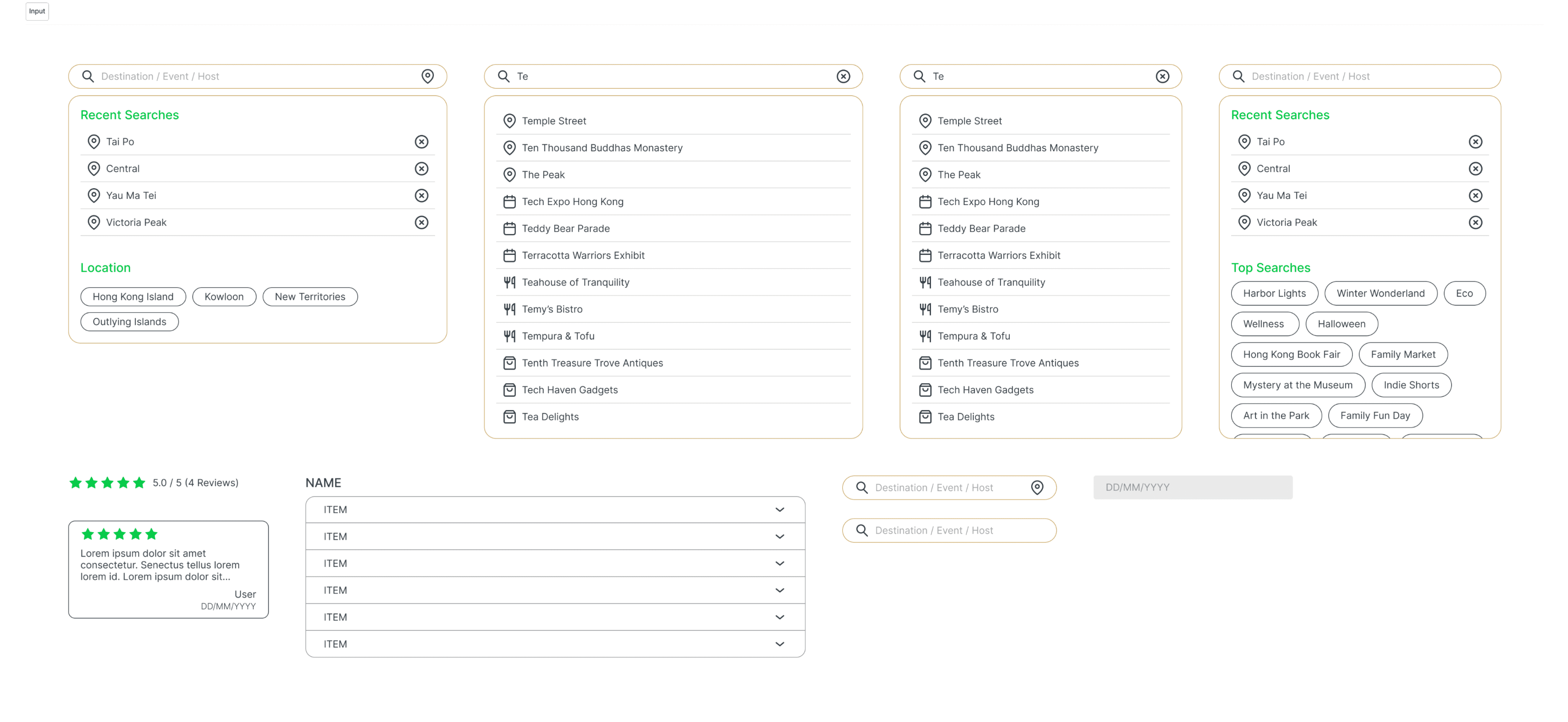
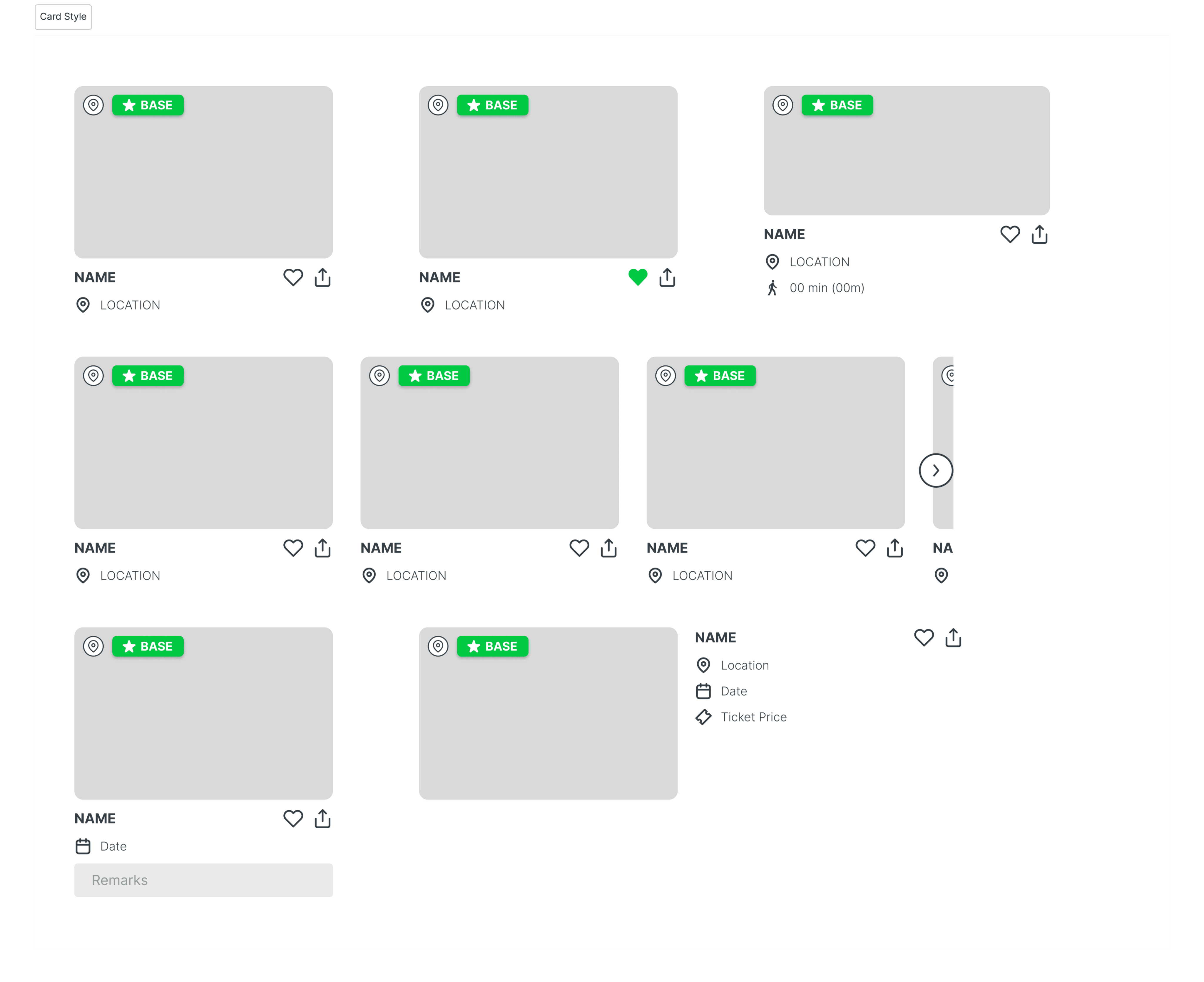
Design Kit
Moderated Usability Testing
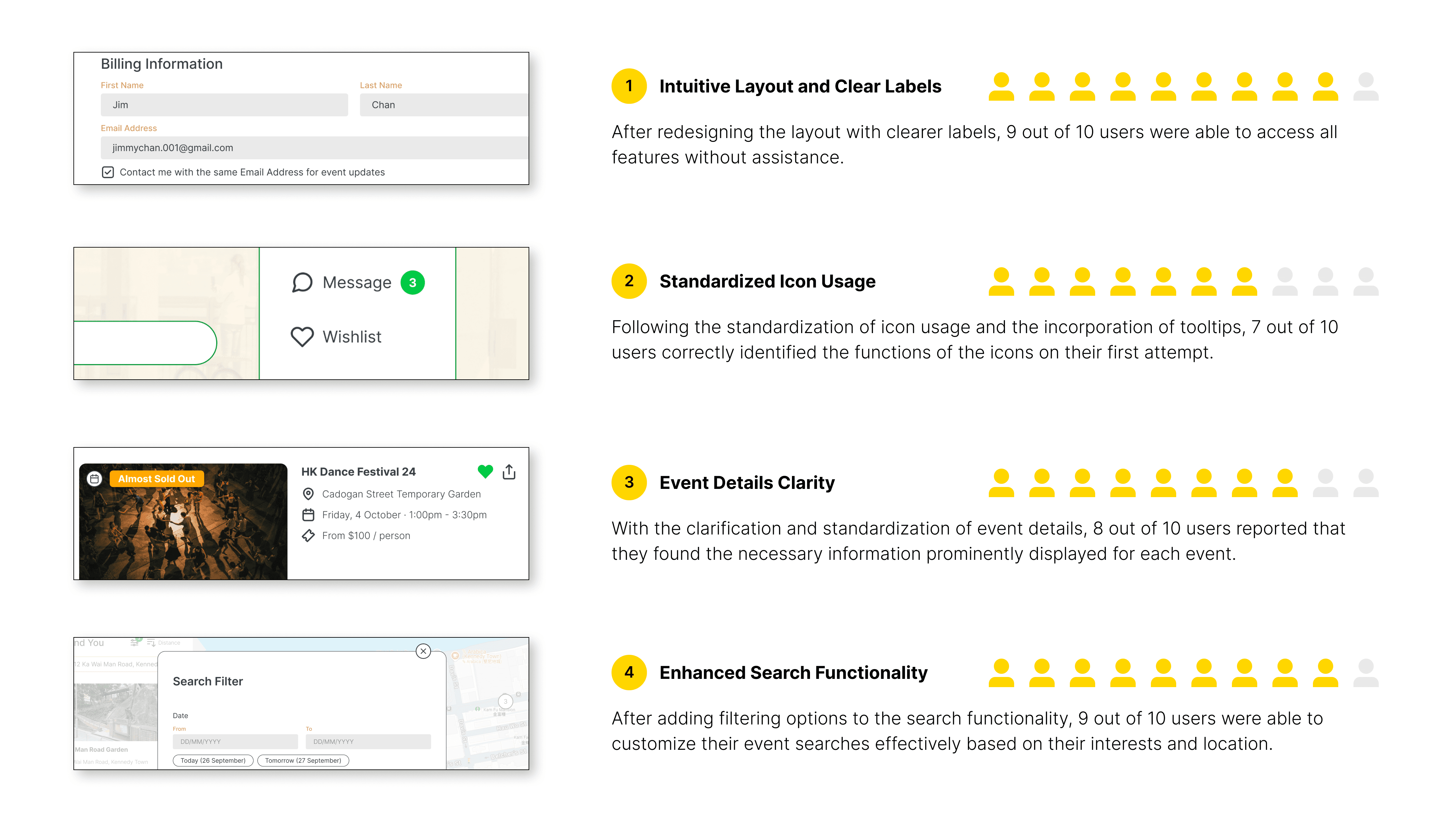
To validate assumptions and changes, I conducted usability testing of the high-fidelity prototype with 10 participants who didn’t participate in the previous low-fidelity prototype testing. I designed new tasks and monitored their completion time and steps via Zoom screen sharing. Post-task discussions were held to gather qualitative feedback.
The results of this usability testing were as follows:
Impact
Shortly after the High-Fidelity Prototype of HK Hopper was completed, I gathered insights from users at various local events and attractions. As I walked them through the app, their reactions were enlightening:
Cultural Connection:
Users expressed excitement about discovering local events they would have missed, enhancing their appreciation for Hong Kong’s culture.Streamlined Navigation:
Participants noted that the app’s intuitive design significantly reduced time spent searching for events, making the experience much more efficient.Empowered Customization:
The robust filtering options allowed users to tailor their searches, leading to unique experiences and increased likelihood of attending events.
Overall, the feedback highlighted the potential of HK Hopper to transform how both locals and tourists engage with Hong Kong’s vibrant event scene.
Takeaways
Further Exploration
As HK Hopper evolves, there are several avenues for further exploration:
User Feedback Loop:
Implementing a feedback mechanism within the app will allow users to share their experiences and suggestions, helping to refine features and improve usability continuously.Event Integration:
Exploring partnerships with local event organizers could enhance the app’s offerings, providing real-time updates on events, ticketing options, and exclusive deals.Personalization Features:
Developing more advanced personalization algorithms could tailor recommendations based on user behavior and preferences, further enhancing user engagement.In-App Friendship Function:
Introducing a feature that allows users to connect with friends and share their itineraries would enhance social interaction, enabling users to plan and attend events together more easily.
By exploring these options, HK Hopper can continue to grow as a valuable resource for discovering and enjoying local events in Hong Kong.
Thank you for reviewing my work on the HK Hopper project!
“The iterative process never ends.” I would appreciate your thoughts and insights on this topic, as feedback is crucial to further enhancing the findings of this study. If you’d like to get in touch or see more, please connect me at henrychau050@gmail.com.
Let’s get in touch!

